Overview of Python Visualization Tools
Posted by Chris Moffitt in articles
Introduction
In the python world, there are multiple options for visualizing your data. Because of this variety, it can be really challenging to figure out which one to use when. This article contains a sample of some of the more popular ones and illustrates how to use them to create a simple bar chart. I will create examples of plotting data with:
In the examples, I will use pandas to manipulate the data and use it to drive the visualization. In most cases these tools can be used without pandas but I think the combination of pandas + visualization tools is so common, it is the best place to start.
What About Matplotlib?
Matplotlib is the grandfather of python visualization packages. It is extremely powerful but with that power comes complexity. You can typically do anything you need using matplotlib but it is not always so easy to figure out. I am not going to walk through a pure Matplotlib example because many of the tools (especially Pandas and Seaborn) are thin wrappers over matplotlib. If you would like to read more about it, I went through several examples in my simple graphing article.
My biggest gripe with Matplotlib is that it just takes too much work to get reasonable looking graphs. In playing around with some of these examples, I found it easier to get nice looking visualization without a lot of code. For one small example of the verbose nature of matplotlib, look at the faceting example on this ggplot post.
Methodology
One quick note on my methodology for this article. I am sure that as soon as people start reading this, they will point out better ways to use these tools. My goal was not to create the exact same graph in each example. I wanted to visualize the data in roughly the same way in each example with roughly the same amount of time researching the solution.
As I went through this process, the biggest challenge I had was formatting the x and y axes and making the data look reasonable given some of the large labels. It also took some time to figure out how each tool wanted the data formatted. Once I figured those parts out, the rest was relatively simple.
Another point to consider is that a bar plot is probably one of the simpler types of graphs to make. These tools allow you to do many more types of plots with data. My examples focus more on the ease of formatting than innovative visualization examples. Also, because of the labels, some of the plots take up a lot of space so I’ve taken the liberty of cutting them off - just to keep the article length manageable. Finally, I have resized images so any blurriness is an issue of scaling and not a reflection on the actual output quality.
Finally, I’m approaching this from the mindset of trying to use another tool in lieu of Excel. I think my examples are more illustrative of displaying in a report, presentation, email or on a static web page. If you are evaluating tools for real time visualization of data or sharing via some other mechanism; then some of these tools offer a lot more capability that I don’t go into.
Data Set
The previous article describes the data we will be working with. I took the scraping example one layer deeper and determined the detail spending items in each category. This data set includes 125 line items but I have chosen to focus only on showing the top 10 to keep it a little simpler. You can find the full data set here.
Pandas
I am using a pandas DataFrame as the starting point for all the various plots. Fortunately, pandas does supply a built in plotting capability for us which is a layer over matplotlib. I will use that as the baseline.
First, import our modules and read in the data into a budget DataFrame. We also want to sort the data and limit it to the top 10 items.
import pandas as pd
import matplotlib.pyplot as plt

budget = pd.read_csv("mn-budget-detail-2014.csv")
budget = budget.sort('amount',ascending=False)[:10]
We will use the same budget lines for all of our examples. Here is what the top 5 items look like:
| category | detail | amount | |
|---|---|---|---|
| 46 | ADMINISTRATION | Capitol Renovation and Restoration Continued | 126300000 |
| 1 | UNIVERSITY OF MINNESOTA | Minneapolis; Tate Laboratory Renovation | 56700000 |
| 78 | HUMAN SERVICES | Minnesota Security Hospital - St. Peter | 56317000 |
| 0 | UNIVERSITY OF MINNESOTA | Higher Education Asset Preservation and Replac… | 42500000 |
| 5 | MINNESOTA STATE COLLEGES AND UNIVERSITIES | Higher Education Asset Preservation and Replac… | 42500000 |
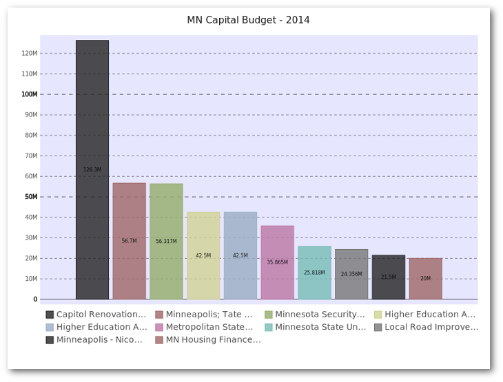
Now, setup our display to use nicer defaults and create a bar plot:
pd.options.display.mpl_style = 'default'
budget_plot = budget.plot(kind="bar",x=budget["detail"],
                          title="MN Capital Budget - 2014",
                          legend=False)
This does all of the heavy lifting of creating the plot using the “detail” column as well as displaying the title and removing the legend.
Here is the additional code needed to save the image as a png.
fig = budget_plot.get_figure()
fig.savefig("2014-mn-capital-budget.png")
Here is what it looks like (truncated to keep the article length manageable):
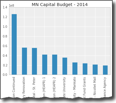
The basics look pretty nice. Ideally, I’d like to do some more formatting of the y-axis but that requires jumping into some matplotlib gymnastics. This is a perfectly serviceable visualization but it’s not possible to do a whole lot more customization purely through pandas.
Seaborn
Seaborn is a visualization library based on matplotlib. It seeks to make default data visualizations much more visually appealing. It also has the goal of making more complicated plots simpler to create. It does integrate well with pandas.
My example does not allow seaborn to significantly differentiate itself. One thing I like about seaborn is the various built in styles which allows you to quickly change the color palettes to look a little nicer. Otherwise, seaborn does not do a lot for us with this simple chart.
Standard imports and read in the data:
import pandas as pd
import seaborn as sns
import matplotlib.pyplot as plt

budget = pd.read_csv("mn-budget-detail-2014.csv")
budget = budget.sort('amount',ascending=False)[:10]
One thing I found out is that I explicitly had to set the order of the
items on the x_axis using
x_order
This section of code sets the order, and styles the plot and bar chart colors:
sns.set_style("darkgrid")
bar_plot = sns.barplot(x=budget["detail"],y=budget["amount"],
                        palette="muted",
                        x_order=budget["detail"].tolist())
plt.xticks(rotation=90)
plt.show()
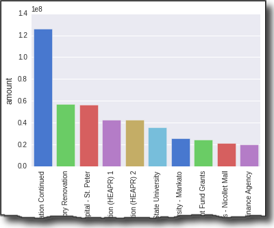
As you can see, I had to use matplotlib to rotate the x axis titles so I could actually read them.
Visually, the display looks nice. Ideally, I’d like to format the ticks on the y-axis but
I couldn’t figure out how to do that without using
plt.yticks
from matplotlib.
ggplot
ggplot is similar to Seaborn in that it builds on top of matplotlib and aims to improve the visual appeal of matplotlib visualizations in a simple way. It diverges from seaborn in that it is a port of ggplot2 for R. Given this goal, some of the API is non-pythonic but it is very powerful.
I have not used ggplot in R so there was a bit of a learning curve. However, I can start to see the appeal of ggplot. The library is being actively developed and I hope it continues to grow and mature because I think it could be a really powerful option. I did have a few times in my learning where I struggled to figure out how to do something. After looking at the code and doing a little googling, I was able to figure most of it out.
Go ahead and import and read our data:
import pandas as pd
from ggplot import *

budget = pd.read_csv("mn-budget-detail-2014.csv")
budget = budget.sort('amount',ascending=False)[:10]
Now we construct our plot by chaining together several ggplot commands:
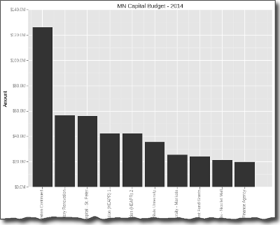
p = ggplot(budget, aes(x="detail",y="amount")) + \
    geom_bar(stat="bar", labels=budget["detail"].tolist()) +\
    ggtitle("MN Capital Budget - 2014") + \
    xlab("Spending Detail") +  \
    ylab("Amount") + scale_y_continuous(labels='millions') + \
    theme(axis_text_x=element_text(angle=90))
print p
This seems a little strange - especially using
print p
to display
the graph. However, I found it relatively straightforward to figure out.
It did take some digging to figure out how to rotate the text 90 degrees as well as figure out how to order the labels on the x-axis.
The coolest feature I found was
scale_y_continous
which makes
the labels come through a lot nicer.
If you want to save the image, it’s easy with
ggsave
:
ggsave(p, "mn-budget-capital-ggplot.png")
Here is the final image. I know it’s a lot of grey scale. I could color it but did not take the time to do so.
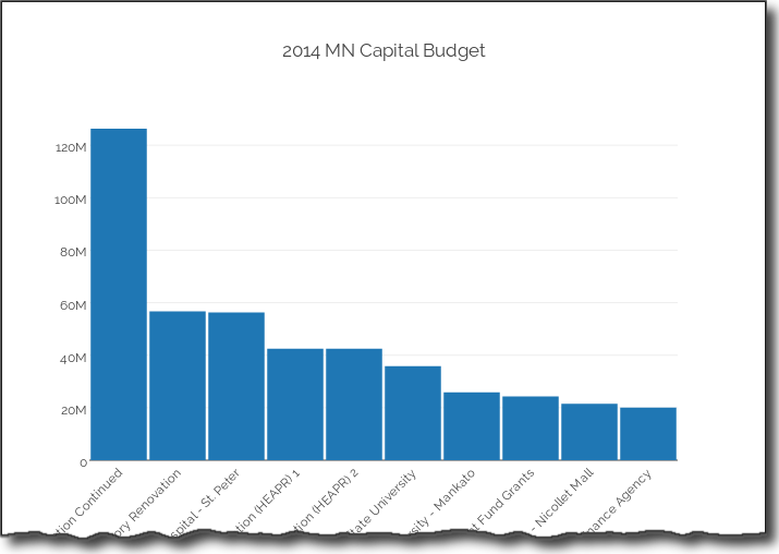
Bokeh
Bokeh is different from the prior three libraries in that it does not depend on matplotlib and is geared toward generating visualizations in modern web browsers. It is meant to make interactive web visualizations so my example is fairly simplistic.
Import and read in the data:
import pandas as pd
from bokeh.charts import Bar

budget = pd.read_csv("mn-budget-detail-2014.csv")
budget = budget.sort('amount',ascending=False)[:10]
One different aspect of bokeh is that I need to explicitly list out the values we want to plot.
details = budget["detail"].values.tolist()
amount = list(budget["amount"].astype(float).values)
Now we can plot it. This code causes the browser to display the HTML page containing the graph. I was able to save a png copy in case I wanted to use it for other display purposes.
bar = Bar(amount, details, filename="bar.html")
bar.title("MN Capital Budget - 2014").xlabel("Detail").ylabel("Amount")
bar.show()
Here is the png image:
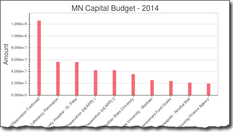
As you can see the graph is nice and clean. I did not find a simple way to more easily format the y-axis. Bokeh has a lot more functionality but I did not dive into in this example.
Pygal
Pygal is used for creating svg charts. If the proper dependencies are installed, you can also save a file as a png. The svg files are pretty useful for easily making interactive charts. I also found that it was pretty easy to create unique looking and visually appealing charts with this tool.
Do our imports and read in the data:
import pandas as pd
import pygal
from pygal.style import LightStyle

budget = pd.read_csv("mn-budget-detail-2014.csv")
budget = budget.sort('amount',ascending=False)[:10]
We need to create the type of chart and set some basic settings:
bar_chart = pygal.Bar(style=LightStyle, width=800, height=600,
                      legend_at_bottom=True, human_readable=True,
                      title='MN Capital Budget - 2014')
One interesting feature to note is
human_readable
which does a nice job of formatting
the data so that it mostly “just works.”
Now we need to add the data to our chart. This is where the integration with pandas is not very tight but I found it straightforward to do for this small data set. Performance might be an issue when there are lots of rows.
for index, row in budget.iterrows():
    bar_chart.add(row["detail"], row["amount"])
Now render the file as an svg and png file:
bar_chart.render_to_file('budget.svg')
bar_chart.render_to_png('budget.png')
I think the svg presentation is really nice and I like how the resulting graph has a unique, visually pleasing style. I also found it relatively easy to figure out what I could and could not do with the tool. I encourage you to download the svg file and look at it in your browser to see the interactive nature of the graph.
Plot.ly
Plot.ly is differentiated by being an online tool for doing analytics and visualization. It has a robust API and includes one for python. Browsing the website, you’ll see that there are lots of very rich, interactive graphs. Thanks to the excellent documentation, creating the bar chart was relatively simple.
You’ll need to follow the docs to get your API key set up. Once you do, it all seems to work pretty seamlessly. The one caveat is that everything you are doing is posted on the web so make sure you are ok with it. There is an option to keep plots private so you do have control over that aspect.
Plotly integrates pretty seamlessly with pandas. I also will give them kudos for being very responsive to an email question I had. I appreciate their timely reply.
Setup my imports and read in the data
import plotly.plotly as py
import pandas as pd
from plotly.graph_objs import *

budget=pd.read_csv("mn-budget-detail-2014.csv")
budget.sort('amount',ascending=False,inplace=True)
budget = budget[:10]
Setup the data and chart type for plotly.
data = Data([
    Bar(
        x=budget["detail"],
        y=budget["amount"]
    )
])
I also decided to add some additional layout information.
layout = Layout(
    title='2014 MN Capital Budget',
    font=Font(
        family='Raleway, sans-serif'
    ),
    showlegend=False,
    xaxis=XAxis(
        tickangle=-45
    ),
    bargap=0.05
)
Finally, plot the data. This will open up a browser and take you to your finished plot.
I originally didn’t see this but you can save a local copy as well, using
py.image.save_as
. This is a really cool feature. You get the interactivity of a rich
web-based report as well as the ability to save a local copy to for embedding in your documents.
fig = Figure(data=data, layout=layout)
plot_url = py.plot(data,filename='MN Capital Budget - 2014')
py.image.save_as(fig, 'mn-14-budget.png')
Check out the full-interactive version too. You can see a lot more robust examples on their site.
The out of the box plot is very appealing and highly interactive. Because of the docs and the python api, getting up and running was pretty easy and I liked the final product.
Summary
Plotting data in the python ecosystem is a good news/bad news story. The good news is that there are a lot of options. The bad news is that there are a lot of options. Trying to figure out which ones works for you will depend on what you’re trying to accomplish. To some degree, you need to play with the tools to figure out if they will work for you. I don’t see one clear winner or clear loser.
Here are a few of my closing thoughts:
- Pandas is handy for simple plots but you need to be willing to learn matplotlib to customize.
- Seaborn can support some more complex visualization approaches but still requires matplotlib knowledge to tweak. The color schemes are a nice bonus.
- ggplot has a lot of promise but is still going through growing pains.
- bokeh is a robust tool if you want to set up your own visualization server but may be overkill for the simple scenarios.
- pygal stands alone by being able to generate interactive svg graphs and png files. It is not as flexible as the matplotlib based solutions.
- Plotly generates the most interactive graphs. You can save them offline and create very rich web-based visualizations.
As it stands now, I’ll continue to watch progress on the ggplot landscape and use pygal and plotly where interactivity is needed.
Feel free to provide feedback in the comments. I am sure people will have lots of questions and comments on this topic. If I’ve missed anything or there are other options out there, let me know.
Updates
- 29-Aug-2016: Published an article about a new library called Altair.
- 25-April-2017: Published another article revisting matplotlib.
- 11-June-2017: Made some grammar changes based on comments below.
- 17-August-2020: Add a link to a more up to date post on Plotly.
Comments