Simple Graphing with IPython and Pandas
Posted by Chris Moffitt in articles
Introduction
This article is a follow on to my previous article on analyzing data with python. I am going to build on my basic intro of IPython, notebooks and pandas to show how to visualize the data you have processed with these tools. I hope that this will demonstrate to you (once again) how powerful these tools are and how much you can get done with such little code. I ultimately hope these articles will help people stop reaching for Excel every time they need to slice and dice some files. The tools in the python environment can be so much more powerful than the manual copying and pasting most people do in excel.
I will walk through how to start doing some simple graphing and plotting of data in pandas. I am using a new data file that is the same format as my previous article but includes data for only 20 customers. If you would like to follow along, the file is available here.
Getting Started
As described in the previous article, I’m using an IPython notebook to explore my data.
First we are going to import pandas, numpy and matplot lib. I am also showing the pandas version I’m using so you can make sure yours is compatible.
import pandas as pd
import numpy as np
import matplotlib.pyplot as plt
pd.__version__
'0.14.1'
Next, enable IPython to display matplotlib graphs.
%matplotlib inline
We will read in the file like we did in the previous article but I’m
going to tell it to treat the date column as a date field (using
parse_dates
) so I can do
some re-sampling later.
sales=pd.read_csv("sample-salesv2.csv",parse_dates=['date'])
sales.head()
| account number | name | sku | category | quantity | unit price | ext price | date | |
|---|---|---|---|---|---|---|---|---|
| 0 | 296809 | Carroll PLC | QN-82852 | Belt | 13 | 44.48 | 578.24 | 2014-09-27 07:13:03 |
| 1 | 98022 | Heidenreich-Bosco | MJ-21460 | Shoes | 19 | 53.62 | 1018.78 | 2014-07-29 02:10:44 |
| 2 | 563905 | Kerluke, Reilly and Bechtelar | AS-93055 | Shirt | 12 | 24.16 | 289.92 | 2014-03-01 10:51:24 |
| 3 | 93356 | Waters-Walker | AS-93055 | Shirt | 5 | 82.68 | 413.40 | 2013-11-17 20:41:11 |
| 4 | 659366 | Waelchi-Fahey | AS-93055 | Shirt | 18 | 99.64 | 1793.52 | 2014-01-03 08:14:27 |
Now that we have read in the data, we can do some quick analysis
sales.describe()
| account number | quantity | unit price | ext price | |
|---|---|---|---|---|
| count | 1000.000000 | 1000.000000 | 1000.000000 | 1000.00000 |
| mean | 535208.897000 | 10.328000 | 56.179630 | 579.84390 |
| std | 277589.746014 | 5.687597 | 25.331939 | 435.30381 |
| min | 93356.000000 | 1.000000 | 10.060000 | 10.38000 |
| 25% | 299771.000000 | 5.750000 | 35.995000 | 232.60500 |
| 50% | 563905.000000 | 10.000000 | 56.765000 | 471.72000 |
| 75% | 750461.000000 | 15.000000 | 76.802500 | 878.13750 |
| max | 995267.000000 | 20.000000 | 99.970000 | 1994.80000 |
We can actually learn some pretty helpful info from this simple command:
- We can tell that customers on average purchases 10.3 items per transaction
- The average cost of the transaction was $579.84
- It is also easy to see the min and max so you understand the range of the data
If we want we can look at a single column as well:
sales['unit price'].describe()
count    1000.000000
mean       56.179630
std        25.331939
min        10.060000
25%        35.995000
50%        56.765000
75%        76.802500
max        99.970000
dtype: float64
I can see that my average price is $56.18 but it ranges from $10.06 to $99.97.
I am showing the output of
dtypes
so that you can see that the date
column is a datetime field. I also scan this to make sure that any
columns that have numbers are floats or ints so that I can do additional
analysis in the future.
sales.dtypes
account number             int64
name                      object
sku                       object
category                  object
quantity                   int64
unit price               float64
ext price                float64
date              datetime64[ns]
dtype: object
Plotting Some Data
We have our data read in and have completed some basic analysis. Let’s start plotting it.
First remove some columns to make additional analysis easier.
customers = sales[['name','ext price','date']]
customers.head()
| name | ext price | date | |
|---|---|---|---|
| 0 | Carroll PLC | 578.24 | 2014-09-27 07:13:03 |
| 1 | Heidenreich-Bosco | 1018.78 | 2014-07-29 02:10:44 |
| 2 | Kerluke, Reilly and Bechtelar | 289.92 | 2014-03-01 10:51:24 |
| 3 | Waters-Walker | 413.40 | 2013-11-17 20:41:11 |
| 4 | Waelchi-Fahey | 1793.52 | 2014-01-03 08:14:27 |
This representation has multiple lines for each customer. In order to understand purchasing patterns, let’s group all the customers by name. We can also look at the number of entries per customer to get an idea for the distribution.
customer_group = customers.groupby('name')
customer_group.size()
name
Berge LLC                        52
Carroll PLC                      57
Cole-Eichmann                    51
Davis, Kshlerin and Reilly       41
Ernser, Cruickshank and Lind     47
Gorczany-Hahn                    42
Hamill-Hackett                   44
Hegmann and Sons                 58
Heidenreich-Bosco                40
Huel-Haag                        43
Kerluke, Reilly and Bechtelar    52
Kihn, McClure and Denesik        58
Kilback-Gerlach                  45
Koelpin PLC                      53
Kunze Inc                        54
Kuphal, Zieme and Kub            52
Senger, Upton and Breitenberg    59
Volkman, Goyette and Lemke       48
Waelchi-Fahey                    54
Waters-Walker                    50
dtype: int64
Now that our data is in a simple format to manipulate, let’s determine how much each customer purchased during our time frame.
The
sum
function allows us to quickly sum up all the values by customer.
We can also sort the data using the
sort
command.
sales_totals = customer_group.sum()
sales_totals.sort(columns='ext price').head()
| ext price | |
|---|---|
| name | |
| Davis, Kshlerin and Reilly | 19054.76 |
| Huel-Haag | 21087.88 |
| Gorczany-Hahn | 22207.90 |
| Hamill-Hackett | 23433.78 |
| Heidenreich-Bosco | 25428.29 |
Now that we know what the data look like, it is very simple to create a quick bar chart plot. Using the IPython notebook, the graph will automatically display.
my_plot = sales_totals.plot(kind='bar')
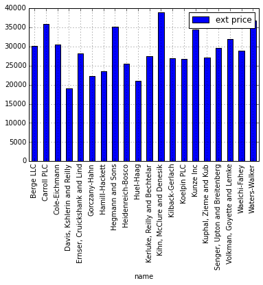
Unfortunately this chart is a little ugly. With a few tweaks we can make it a little more impactful. Let’s try:
- sorting the data in descending order
- removing the legend
- adding a title
- labeling the axes
my_plot = sales_totals.sort(columns='ext price',ascending=False).plot(kind='bar',legend=None,title="Total Sales by Customer")
my_plot.set_xlabel("Customers")
my_plot.set_ylabel("Sales ($)")
<matplotlib.text.Text at 0x7ff9bf23c510>
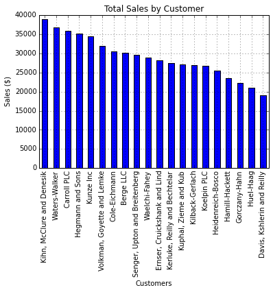
This actually tells us a little about our biggest customers and how much difference there is between their sales and our smallest customers.
Now, let’s try to see how the sales break down by category.
customers = sales[['name','category','ext price','date']]
customers.head()
| name | category | ext price | date | |
|---|---|---|---|---|
| 0 | Carroll PLC | Belt | 578.24 | 2014-09-27 07:13:03 |
| 1 | Heidenreich-Bosco | Shoes | 1018.78 | 2014-07-29 02:10:44 |
| 2 | Kerluke, Reilly and Bechtelar | Shirt | 289.92 | 2014-03-01 10:51:24 |
| 3 | Waters-Walker | Shirt | 413.40 | 2013-11-17 20:41:11 |
| 4 | Waelchi-Fahey | Shirt | 1793.52 | 2014-01-03 08:14:27 |
We can use
groupby
to organize the data by category and name.
category_group=customers.groupby(['name','category']).sum()
category_group.head()
| ext price | ||
|---|---|---|
| name | category | |
| Berge LLC | Belt | 6033.53 |
| Shirt | 9670.24 | |
| Shoes | 14361.10 | |
| Carroll PLC | Belt | 9359.26 |
| Shirt | 13717.61 |
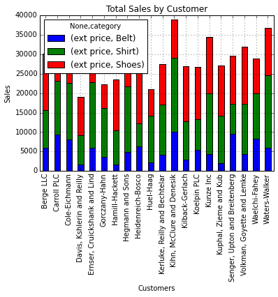
The category representation looks good but we need to break it apart to
graph it as a stacked bar graph.
unstack
can do this for us.
category_group.unstack().head()
| ext price | |||
|---|---|---|---|
| category | Belt | Shirt | Shoes |
| name | |||
| Berge LLC | 6033.53 | 9670.24 | 14361.10 |
| Carroll PLC | 9359.26 | 13717.61 | 12857.44 |
| Cole-Eichmann | 8112.70 | 14528.01 | 7794.71 |
| Davis, Kshlerin and Reilly | 1604.13 | 7533.03 | 9917.60 |
| Ernser, Cruickshank and Lind | 5894.38 | 16944.19 | 5250.45 |
Now plot it.
my_plot = category_group.unstack().plot(kind='bar',stacked=True,title="Total Sales by Customer")
my_plot.set_xlabel("Customers")
my_plot.set_ylabel("Sales")
<matplotlib.text.Text at 0x7ff9bf03fc10>
In order to clean this up a little bit, we can specify the figure size and customize the legend.
my_plot = category_group.unstack().plot(kind='bar',stacked=True,title="Total Sales by Customer",figsize=(9, 7))
my_plot.set_xlabel("Customers")
my_plot.set_ylabel("Sales")
my_plot.legend(["Total","Belts","Shirts","Shoes"], loc=9,ncol=4)
<matplotlib.legend.Legend at 0x7ff9bed5f710>
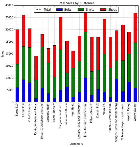
Now that we know who the biggest customers are and how they purchase products, we might want to look at purchase patterns in more detail.
Let’s take another look at the data and try to see how large the individual purchases are. A histogram allows us to group purchases together so we can see how big the customer transactions are.
purchase_patterns = sales[['ext price','date']]
purchase_patterns.head()
| ext price | date | |
|---|---|---|
| 0 | 578.24 | 2014-09-27 07:13:03 |
| 1 | 1018.78 | 2014-07-29 02:10:44 |
| 2 | 289.92 | 2014-03-01 10:51:24 |
| 3 | 413.40 | 2013-11-17 20:41:11 |
| 4 | 1793.52 | 2014-01-03 08:14:27 |
We can create a histogram with 20 bins to show the distribution of purchasing patterns.
purchase_plot = purchase_patterns['ext price'].hist(bins=20)
purchase_plot.set_title("Purchase Patterns")
purchase_plot.set_xlabel("Order Amount($)")
purchase_plot.set_ylabel("Number of orders")
<matplotlib.text.Text at 0x7ff9becdc210>
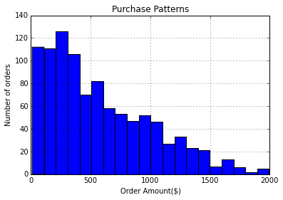
In looking at purchase patterns over time, we can see that most of our transactions are less than $500 and only a very few are about $1500.
Another interesting way to look at the data would be by sales over time. A chart might help us understand, “Do we have certain months where we are busier than others?”
Let’s get the data down to order size and date.
purchase_patterns = sales[['ext price','date']]
purchase_patterns.head()
| ext price | date | |
|---|---|---|
| 0 | 578.24 | 2014-09-27 07:13:03 |
| 1 | 1018.78 | 2014-07-29 02:10:44 |
| 2 | 289.92 | 2014-03-01 10:51:24 |
| 3 | 413.40 | 2013-11-17 20:41:11 |
| 4 | 1793.52 | 2014-01-03 08:14:27 |
If we want to analyze the data by date, we need to set the date column
as the index using
set_index
.
purchase_patterns = purchase_patterns.set_index('date')
purchase_patterns.head()
| ext price | |
|---|---|
| date | |
| 2014-09-27 07:13:03 | 578.24 |
| 2014-07-29 02:10:44 | 1018.78 |
| 2014-03-01 10:51:24 | 289.92 |
| 2013-11-17 20:41:11 | 413.40 |
| 2014-01-03 08:14:27 | 1793.52 |
One of the really cool things that pandas allows us to do is resample the data. If we want to look at the data by month, we can easily resample and sum it all up. You’ll notice I’m using ‘M’ as the period for resampling which means the data should be resampled on a month boundary.
purchase_patterns.resample('M',how=sum)
Plotting the data is now very easy
purchase_plot = purchase_patterns.resample('M',how=sum).plot(title="Total Sales by Month",legend=None)
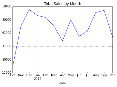
Looking at the chart, we can easily see that December is our peak month and April is the slowest.
Let’s say we really like this plot and want to save it somewhere for a presentation.
fig = purchase_plot.get_figure()
fig.savefig("total-sales.png")
Pulling it all together
In my typical workflow, I would follow the process above of using an IPython notebook to play with the data and determine how best to make this process repeatable. If I intend to run this analysis on a periodic basis, I will create a standalone script that will do all this with one command.
Here is an example of pulling all this together into a single file:
# Standard import for pandas, numpy and matplot
import pandas as pd
import numpy as np
import matplotlib.pyplot as plt

# Read in the csv file and display some of the basic info
sales=pd.read_csv("sample-salesv2.csv",parse_dates=['date'])
print "Data types in the file:"
print sales.dtypes
print "Summary of the input file:"
print sales.describe()
print "Basic unit price stats:"
print sales['unit price'].describe()

# Filter the columns down to the ones we need to look at for customer sales
customers = sales[['name','ext price','date']]

#Group the customers by name and sum their sales
customer_group = customers.groupby('name')
sales_totals = customer_group.sum()

# Create a basic bar chart for the sales data and show it
bar_plot = sales_totals.sort(columns='ext price',ascending=False).plot(kind='bar',legend=None,title="Total Sales by Customer")
bar_plot.set_xlabel("Customers")
bar_plot.set_ylabel("Sales ($)")
plt.show()

# Do a similar chart but break down by category in stacked bars
# Select the appropriate columns and group by name and category
customers = sales[['name','category','ext price','date']]
category_group = customers.groupby(['name','category']).sum()

# Plot and show the stacked bar chart
stack_bar_plot = category_group.unstack().plot(kind='bar',stacked=True,title="Total Sales by Customer",figsize=(9, 7))
stack_bar_plot.set_xlabel("Customers")
stack_bar_plot.set_ylabel("Sales")
stack_bar_plot.legend(["Total","Belts","Shirts","Shoes"], loc=9,ncol=4)
plt.show()

# Create a simple histogram of purchase volumes
purchase_patterns = sales[['ext price','date']]
purchase_plot = purchase_patterns['ext price'].hist(bins=20)
purchase_plot.set_title("Purchase Patterns")
purchase_plot.set_xlabel("Order Amount($)")
purchase_plot.set_ylabel("Number of orders")
plt.show()

# Create a line chart showing purchases by month
purchase_patterns = purchase_patterns.set_index('date')
month_plot = purchase_patterns.resample('M',how=sum).plot(title="Total Sales by Month",legend=None)
fig = month_plot.get_figure()

#Show the image, then save it
plt.show()
fig.savefig("total-sales.png")
The impressive thing about this code is that in 55 lines (including comments), I’ve created a very powerful yet simple to understand program to repeatedly manipulate the data and create useful output.
I hope this is useful. Feel free to provide feedback in the comments and let me know if this is helpful.
Comments