Choosing a Python Visualization Tool
Posted by Chris Moffitt in articles
Introduction
This brief article introduces a flowchart that shows how to select a python visualization tool for the job at hand. The criteria for choosing the tools is weighted more towards the “common” tools out there that have been in use for several years. There may be some debate about some of the recommendations but I believe this should be helpful for someone that is new to the python visualization landscape and trying to make a decision about where to invest their time to learn how to use one of these libraries.
Assumptions and Prior Art
The most basic assumption is that the data you wish to plot is in a pandas dataframe. My second assumption is that these plots would be used to visualize data as part of Exploratory Data Analysis (EDA). The goal is to quickly create meaningful plots in order to understand the data. In some instances, the EDA could turn into an interactive plotting application which I briefly discuss later in the article.
There are a couple of really good resources out there that cover this topic in more detail:
- Dramatic Tour of Python’s Visualization Landscape by Dan Saber
- Python Plotting for EDA by Tim Hopper
- Overview of Python Visualization Tools from this blog
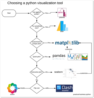
The Chart
Here is the flow chart. I will walk through the logic below.

A Quick Tour of The Decision Points
Use ggplot2 syntax?
ggplot2 is a plotting system for R and many newer python users that are more familiar with it, are looking for something in python that matches the syntax and power of ggplot2. There have been a few fits and starts in this space, but it looks like plotnine is being actively maintained and supports much of the ggplot2 syntax. If you are interested in porting your ggplot2 knowledge to python, I would encourage you to check it out.
Try something new?
The python landscape is ever-changing and sometimes libraries will pop up and slowly die. Fortunately, I do not think this will be the case with Altair. As of this blog post, it is moving close to a 2.0 release. The current release candidate look really impressive and I think Altair is going to be one of the core plotting libraries for python in the near future. You can refer to this prior post for an overview or look at the gallery for examples of what it can do. I am particularly excited about some of the interactive options and geographic plotting capabilities.
If you are comfortable with most of the other python plotting options, take a moment and look at Altair and help the team build its capabilities. In my experience, Altair’s plots are very nice and it’s declarative approach to visualization is very powerful. The final API is under active development so I think more eyes on this project will make the overall solution that much better.
Customized or Unique plot?
For certain types of very unique or customized plots, you may need to build your own solution. That’s where matplotlib excels. For example, I wrote about creating waterfall charts and bullet graphs. Both of these chart types would be difficult to create in any of the other tools included in this flowchart.
To give you a feel for the types of charts that fall in this category, here are some examples:

In addition to building your own charts, matplotlib is the basis for the pandas and seaborn plotting capabilities. My matplotlib article shows how to use matplotlib to customize your pandas plots. I think having a base understanding of how matplotlib works is important no matter which tool you end up using.
Quick Plot?
Since pandas is such a core part of any data analysis in python, I frequently find myself using it to generate quick plots that help me determine if it is worth doing more complex plots later. You can use matplotlib to customize pandas plots or use the basic insights to create something more complex in a tool like seaborn.
Interactive Plots
The final big decision point is whether or not you need to build an interactive plot. Altair is building some unique capabilities in this space, but I think there will still be a need for building quick and useful applications for visualizing data.
I have written about dash and bokeh in prior articles and I encourage you to review them if you’re interested. At this point, I don’t have a clear recommendation on which one is “best.” I think they are both really powerful and are worth considering. They are both open source tools with the backing of respected companies. They each have their own API’s and capabilities. The final solution for your needs will come down to which approach makes the most sense to you and supports getting up and running as quickly as possible.
Seaborn
If you need more complex plots that facet data across rows and columns, then seaborn is going to be the right tool for the job. Similar to pandas, seaborn relies on matplotlib so you can use the base matplotlib concepts to further customize your seaborn plots. Here is a simple example of using seaborn to create multiple box plots for several subsets of data.

Altair supports some of the faceting options that Seaborn supports so in the future, this distinction may not be as clear. However, I think there will always be a place for seaborn in the visualization landscape so it has an important place in your visualization toolkit.
Summary
Some complain about how python does not have the definitive plotting tool like R’s ggplot2. However, I think the ecosystem has grown and matured over time and the 7 different tools described here provide a lot of power for the python user. Going forward, I plan to update this article over the months ahead as the python visualization space continues to evolve.
Feel free to comment below with questions or thoughts on these recommendations.
Changes
- 17-August-2020: Added link to new Plotly article.
Comments