Creating Interactive Visualizations with Plotly’s Dash Framework
Posted by Chris Moffitt in articles
Introduction
Python’s visualization landscape is quite complex with many available libraries for various types of data visualization. In previous articles, I have covered several approaches for visualizing data in python. These options are great for static data but oftentimes there is a need to create interactive visualizations to more easily explore data. Trying to cobble interactive charts together by hand is possible but certainly not desirable when deployment speed is critical. That’s where Dash comes in.
Dash is an open source framework created by the plotly team that leverages Flask, plotly.js and React.js to build custom data visualization apps. This article is a high level overview of how to get started with dash to build a simple, yet powerful interactive dashboard.
What is Dash
In June of 2017, plotly formally released Dash as an open source library for creating interactive web-based visualizations. The library is built on top of well established open source frameworks like flask for serving the pages and React.js for the javascript user interface. The unique aspect of this library is that you can build highly interactive web application solely using python code. Having knowledge of HTML and javascript is useful but certainly not required to get a nice display with a minimal amount of coding.
The other benefit of this approach is that by using python, it is simple to incorporate all the power and convenience of pandas (and other python tools) for manipulating the data. Another nice benefit of this approach is that the user can access all the plotting capabilities already available through plotly’s existing framework.
Finally, I am very happy to see this open source model adopted by companies. For those individuals that just want to use the open source tools, they are hosted on github like so many other packages. However, if someone wants/needs formal support there is a dedicated company behind the package that provides additional value added support such as training and large scale deployments.
Getting Started
As of the time of this article (October 2017), the installation instructions for Dash were pretty straightforward. I installed the specified dependencies via pip:
pip install dash==0.18.3
pip install dash-renderer==0.10.0
pip install dash-html-components==0.7.0
pip install dash-core-components==0.12.6
pip install plotly --upgrade
In the future, I would recommend double checking the installation guide to make sure that the correct versions are being used.
In order to make sure everything was working properly, I created a simple app.py file as describe in the getting started docs and tried running it:
(pbpython3)$ python app.py
 * Running on http://127.0.0.1:8050/ (Press CTRL+C to quit)
 * Restarting with stat
 * Debugger is active!
 * Debugger PIN: 1234
By opening up a browser and pointing to the url, I could see a nice interactive bar chart as shown in the docs. This confirmed that all was installed and working as expected. The next step was building my own version.
A Stacked Bar Chart
In order to build a little more complex example, I decided to use the data from the Creating PDF Reports article to build an interactive bar chart that shows order status by customer.
The first step in creating the app is to bring in all the dash modules as well as pandas
for reading and manipulating the data. I saved this file as
stacked_bar_app.py
:
import dash
import dash_core_components as dcc
import dash_html_components as html
import plotly.graph_objs as go
import pandas as pd
If you are following along closely, you may notice that I am importing the
plotly.graph_objs
in this example whereas the documentation uses
dcc.graph
to build the plot. As I was going through this article, I felt
that it was easier to use the plotly graph object since there were a lot more examples
of using it than there were the plain
dcc.graph
for the simple cases.
It’s a matter of preference but it seemed a little more straightforward to me
during the creation of these examples to use the plotly graph objects.
I decided to use an example where the data was not just a simple flat file that needed to be plotted. There is a pivot that needs to happen to get the data in a format where I can stack the bars. This is pretty easy with the pivot_table
df = pd.read_excel("https://github.com/chris1610/pbpython/blob/master/data/salesfunnel.xlsx?raw=True")
pv = pd.pivot_table(df, index=['Name'], columns=["Status"], values=['Quantity'], aggfunc=sum, fill_value=0)
| Quantity | ||||
|---|---|---|---|---|
| Status | declined | pending | presented | won |
| Name | ||||
| Barton LLC | 1 | 0 | 0 | 0 |
| Fritsch, Russel and Anderson | 1 | 0 | 0 | 0 |
| Herman LLC | 0 | 0 | 0 | 2 |
| Jerde-Hilpert | 0 | 2 | 0 | 0 |
| Kassulke, Ondricka and Metz | 0 | 0 | 0 | 3 |
| Keeling LLC | 0 | 0 | 0 | 5 |
| Kiehn-Spinka | 0 | 0 | 0 | 2 |
| Koepp Ltd | 2 | 0 | 2 | 0 |
| Kulas Inc | 0 | 2 | 1 | 0 |
| Purdy-Kunde | 0 | 0 | 1 | 0 |
| Stokes LLC | 0 | 1 | 1 | 0 |
| Trantow-Barrows | 0 | 2 | 2 | 0 |
Now that the data is simply tabulated by customer and status, we can build out the bars that show the various customer status counts.
The convention for plotly is that each item being plotted is usually called a
trace
.
In this example, we want to plot Declined, Pending, Presented and Won as stacked bar
charts so we need a trace for each one. Because we pivoted the data, the customer name
is in the index and the individual values can be accessed through the hierarchical index on the
column. Finally, the
name
will be used on the legend to describe the trace.
trace1 = go.Bar(x=pv.index, y=pv[('Quantity', 'declined')], name='Declined')
trace2 = go.Bar(x=pv.index, y=pv[('Quantity', 'pending')], name='Pending')
trace3 = go.Bar(x=pv.index, y=pv[('Quantity', 'presented')], name='Presented')
trace4 = go.Bar(x=pv.index, y=pv[('Quantity', 'won')], name='Won')
Now that we have set everything up, we can build the actual dash app.
app = dash.Dash()
app.layout = html.Div(children=[
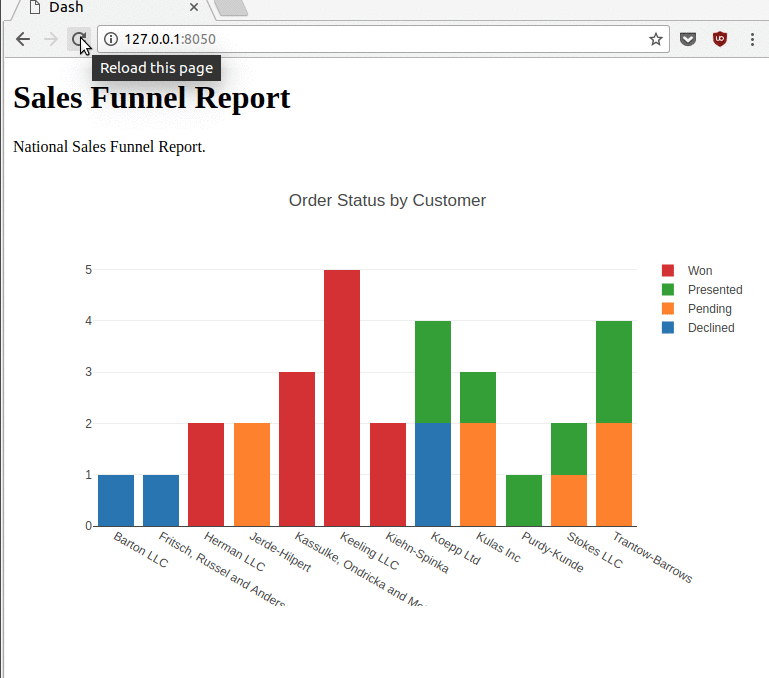
html.H1(children='Sales Funnel Report'),
html.Div(children='''National Sales Funnel Report.'''),
dcc.Graph(
id='example-graph',
figure={
'data': [trace1, trace2, trace3, trace4],
'layout':
go.Layout(title='Order Status by Customer', barmode='stack')
})
])
The basic structure of this code is to build the app, layout the HTML components and create the figure dictionary which contains the instructions to build the graph as well as provide other layout options.
The most challenging aspect of this is the nesting of the HTML components. I like the fact that it was easy to get started without having to create the standard HTML/CSS/JS boilerplate needed for a modern web app. However, I do recommend using a good editor so it is easy to manage the code style and match the brackets and parentheses.
After laying out the HTML components, the next step is to define the figure using
a dictionary that contains the
figure
as well as the
data
and
layout
options. In this case, the layout was needed to define that the bars
were stacked and provide an overall title.
Once the app is laid out, we need to make sure it can run:
if __name__ == '__main__':
    app.run_server(debug=True)
Here is a quick animation that shows all the interactive options you get for free by using this framework.
After typing:
python stacked_bar_app.py
You can get this nice interactive chart:
The entire code looks like this:
import dash
import dash_core_components as dcc
import dash_html_components as html
import plotly.graph_objs as go
import pandas as pd

df = pd.read_excel(
    "https://github.com/chris1610/pbpython/blob/master/data/salesfunnel.xlsx?raw=True"
)

pv = pd.pivot_table(df, index=['Name'], columns=["Status"], values=['Quantity'], aggfunc=sum, fill_value=0)


trace1 = go.Bar(x=pv.index, y=pv[('Quantity', 'declined')], name='Declined')
trace2 = go.Bar(x=pv.index, y=pv[('Quantity', 'pending')], name='Pending')
trace3 = go.Bar(x=pv.index, y=pv[('Quantity', 'presented')], name='Presented')
trace4 = go.Bar(x=pv.index, y=pv[('Quantity', 'won')], name='Won')

app = dash.Dash()
app.layout = html.Div(children=[
    html.H1(children='Sales Funnel Report'),
    html.Div(children='''National Sales Funnel Report.'''),
    dcc.Graph(
        id='example-graph',
        figure={
            'data': [trace1, trace2, trace3, trace4],
            'layout':
            go.Layout(title='Order Status by Customer', barmode='stack')
        })
])

if __name__ == '__main__':
    app.run_server(debug=True)
It is pretty amazing when you think about how much interactivity you can get with a fairly simple application that weighs in around 33 lines of code. For future reference, the code is available on github.
The other really useful side effect of this approach is that all the hard work around making this responsive and scalable on different browsers is already taken care of for you. No additional CSS/JS work required. Pure python all the way!
More Complex Example
The above example goes a little bit further than the first demo in the documentation. The real power of Dash though is its ability to do more complex interactions. Dash provides several interactive components out of the box including Dropdowns, Multi-Select Dropdowns, Radio Buttons, Checkboxes, Sliders, and Text Input. All of them can be easily constructed and tied into your plots to drive various interactive options.
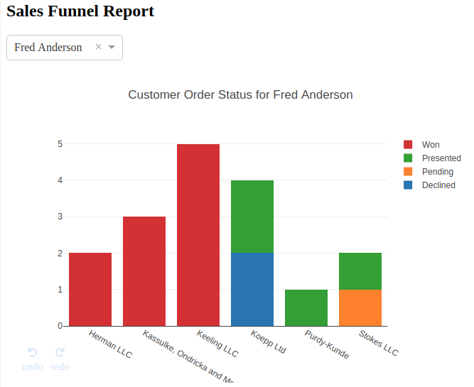
For the more complex demo, we can modify the app to allow the user to select one of the managers via a dropdown and view the single manager’s results only.
For this example, I will create a file called
stacked_bar_interactive.py
that starts out in a similar way to the past example:
import dash
import dash_core_components as dcc
import dash_html_components as html
import plotly.graph_objs as go
import pandas as pd

df = pd.read_excel(
    "https://github.com/chris1610/pbpython/blob/master/data/salesfunnel.xlsx?raw=True"
)
Now that the data is read in, we need to get a list of all the managers in
order to populate the dropdown which can be done using pandas
unique
function.
mgr_options = df["Manager"].unique()
The next block of code will create the app and add the layout which will include
a
dcc.Dropdown
to define the manager dropdown field.
app = dash.Dash()

app.layout = html.Div([
    html.H2("Sales Funnel Report"),
    html.Div(
        [
            dcc.Dropdown(
                id="Manager",
                options=[{
                    'label': i,
                    'value': i
                } for i in mgr_options],
                value='All Managers'),
        ],
        style={'width': '25%',
               'display': 'inline-block'}),
    dcc.Graph(id='funnel-graph'),
])
There a couple of items to note in this section. The
dropdown
needs
to have an
id
defined that can be referenced later to drive our interactivity.
You may also notice that the
dcc.Graph
code only contains an
id
and not the rest of the content we saw earlier. Since this is an interactive plot
the
dcc.Graph
acts as a placeholder that we will define in a moment.
The final aspect of this section is that there is a
style
attribute which
is a convenient way to make sure the component (in this case the dropdown) is
only 25% of the screen and does not span the entire browser.
Now that the layout is completed, we can build up the interactive components
by adding a callback decorator to a function that manipulates the data and
returns a dictionary. This resulting dictionary looks like the
figure
dictionary defined in the simpler example above so the basic concept continues
to build upon itself.
@app.callback(
    dash.dependencies.Output('funnel-graph', 'figure'),
    [dash.dependencies.Input('Manager', 'value')])
def update_graph(Manager):
This looks a little complex but all it is doing is providing a wrapper
around the
update_graph
function that defines an output and an input. In
this case the output is the
funnel-graph
and the input
Manager.
In other words this decorator knows how to link the drop down definition to the
function and take the output and place it in the
dcc.Graph
. This little
bit of decorator magic is where the real power of Dash can be seen. It may seem a
little complex at first but the basic concept is straightforward and once you understand
it, you can really build some complex interactive visualizations.
The rest of the code manipulates the data based on the Manager drop down selection and displays the results.
def update_graph(Manager):
    if Manager == "All Managers":
        df_plot = df.copy()
    else:
        df_plot = df[df['Manager'] == Manager]

    pv = pd.pivot_table(
        df_plot,
        index=['Name'],
        columns=["Status"],
        values=['Quantity'],
        aggfunc=sum,
        fill_value=0)
This portion of the function filters the data based on the dropdown to include only a subset of the managers - or include all managers is the default is selected. After filtering the dataframe, the code pivots the data to construct the tabular results similar to the earlier example.
The next portion of the code defines the traces:
trace1 = go.Bar(x=pv.index, y=pv[('Quantity', 'declined')], name='Declined')
trace2 = go.Bar(x=pv.index, y=pv[('Quantity', 'pending')], name='Pending')
trace3 = go.Bar(x=pv.index, y=pv[('Quantity', 'presented')], name='Presented')
trace4 = go.Bar(x=pv.index, y=pv[('Quantity', 'won')], name='Won')
Nothing new here.
The final step is to return a dictionary with the figure and layout defined. The decorator we defined earlier will make sure that the updated chart gets included in the output display.
return {
    'data': [trace1, trace2, trace3, trace4],
    'layout':
    go.Layout(
        title='Customer Order Status for {}'.format(Manager),
        barmode='stack')
}
The final step is to make sure the app runs:
if __name__ == '__main__':
    app.run_server(debug=True)
So, what does this awesome app look like? Here it is:
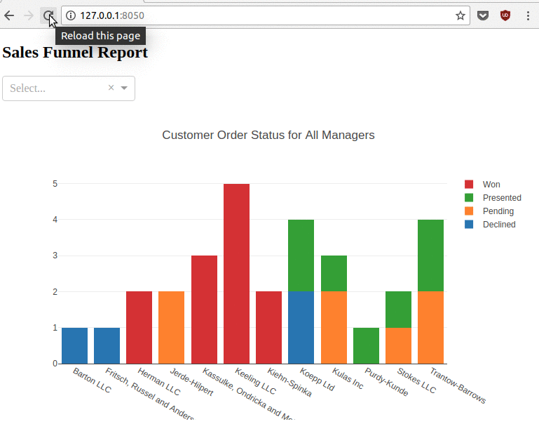
Here is the final app:
import dash
import dash_core_components as dcc
import dash_html_components as html
import plotly.graph_objs as go
import pandas as pd

df = pd.read_excel(
    "https://github.com/chris1610/pbpython/blob/master/data/salesfunnel.xlsx?raw=True"
)
mgr_options = df["Manager"].unique()

app = dash.Dash()

app.layout = html.Div([
    html.H2("Sales Funnel Report"),
    html.Div(
        [
            dcc.Dropdown(
                id="Manager",
                options=[{
                    'label': i,
                    'value': i
                } for i in mgr_options],
                value='All Managers'),
        ],
        style={'width': '25%',
               'display': 'inline-block'}),
    dcc.Graph(id='funnel-graph'),
])


@app.callback(
    dash.dependencies.Output('funnel-graph', 'figure'),
    [dash.dependencies.Input('Manager', 'value')])
def update_graph(Manager):
    if Manager == "All Managers":
        df_plot = df.copy()
    else:
        df_plot = df[df['Manager'] == Manager]

    pv = pd.pivot_table(
        df_plot,
        index=['Name'],
        columns=["Status"],
        values=['Quantity'],
        aggfunc=sum,
        fill_value=0)

    trace1 = go.Bar(x=pv.index, y=pv[('Quantity', 'declined')], name='Declined')
    trace2 = go.Bar(x=pv.index, y=pv[('Quantity', 'pending')], name='Pending')
    trace3 = go.Bar(x=pv.index, y=pv[('Quantity', 'presented')], name='Presented')
    trace4 = go.Bar(x=pv.index, y=pv[('Quantity', 'won')], name='Won')

    return {
        'data': [trace1, trace2, trace3, trace4],
        'layout':
        go.Layout(
            title='Customer Order Status for {}'.format(Manager),
            barmode='stack')
    }


if __name__ == '__main__':
    app.run_server(debug=True)
This application is about 68 lines of code which is not too bad when you consider how much is being done:
- Fully interactive interface with the charts
- Drop down selection of various managers
- Ability to save the plot as a png file
- Pan and zoom options
- Multiple level undo
- Automatic resizing of the plot as window sizes change
Here is the link to the github code.
Final Thoughts
I am excited to see how the Dash framework continues to grow and develop over time. It is a very powerful tool for quickly building web based visualization tools without having a lot of knowledge of javascript and other web technologies. The nice benefit of the framework is that the default approach is very responsive and provides ability to save, zoom, pan and interact with the display without doing any extra work. I can see this being a really useful option when people are struggling with how to present their visualizations to their colleagues or make an application that allows non-technical individuals to view their results.
Comments