Building Bullet Graphs and Waterfall Charts with Bokeh
Posted by Chris Moffitt in articles
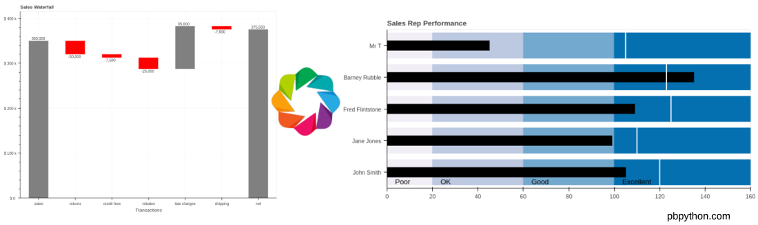
Introduction
In my last article, I presented a flowchart that can be useful for those trying to select the appropriate python library for a visualization task. Based on some comments from that article, I decided to use Bokeh to create waterfall charts and bullet graphs. The rest of this article shows how to use Bokeh to create these unique and useful visualizations.
Bullet Graphs
In the comments section of the last article, Bryan Van de Ven provided example code for creating a bullet graph in Bokeh. For those of you that do not know Bryan, he is a Senior Software Engineer at Anaconda and is one of the creators of Bokeh. It is safe to say he knows that library well so I figured I should listen to his comments!
I took his example and expand it a bit and included it here in order to compare to the matplotlib process. In the process of building these examples, I learned a lot more about how to use Bokeh and hope this article will show others how to use Bokeh. I’ll be honest, I do think the resulting code is simpler to understand than the matplotlib bullet graph example.
I have posted this notebook on github so feel free to download it and use it to follow along. Unfortunately the Bokeh charts do not render in github but if you wish to use this example, it should run on your system as long as the dependencies are installed.
First, let’s do the imports and enable Bokeh’s output to display in our notebook:
from bokeh.io import show, output_notebook
from bokeh.palettes import PuBu4
from bokeh.plotting import figure
from bokeh.models import Label

output_notebook()

For this example, we’ll populate the data with python lists. We could modify this to fit in a pandas dataframe but we will stick with simple python data types for this example:
data= [("John Smith", 105, 120),
       ("Jane Jones", 99, 110),
       ("Fred Flintstone", 109, 125),
       ("Barney Rubble", 135, 123),
       ("Mr T", 45, 105)]

limits = [0, 20, 60, 100, 160]
labels = ["Poor", "OK", "Good", "Excellent"]
cats = [x[0] for x in data]
The code is a pretty straightforward definition of the data. The one tricky code portion
is building out a list of categories in the
cats
variable that will go on the y-axis.
The next step is to create the Bokeh figure and set a couple of options related
to the way the x-axis and grid lines are displayed. As mentioned above, we use
the
cats
variable to define all the categories in the
y_range
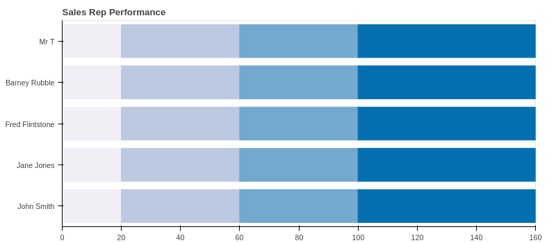
p=figure(title="Sales Rep Performance", plot_height=350, plot_width=800, y_range=cats)
p.x_range.range_padding = 0
p.grid.grid_line_color = None
p.xaxis[0].ticker.num_minor_ticks = 0
The next section will create the colored range bars using bokeh’s
hbar
.
To make this work, we need to define the
left
and
right
range
of each bar along with the
color
. We can use python’s
zip
function to
create the data structure we need:
zip(limits[:-1], limits[1:], PuBu4[::-1])
[(0, 20, '#f1eef6'),
 (20, 60, '#bdc9e1'),
 (60, 100, '#74a9cf'),
 (100, 160, '#0570b0')]
Here’s how to pull it all together to create the color ranges:
for left, right, color in zip(limits[:-1], limits[1:], PuBu4[::-1]):
    p.hbar(y=cats, left=left, right=right, height=0.8, color=color)
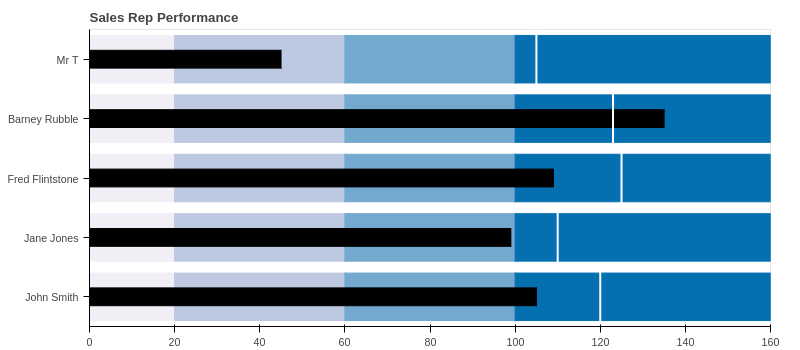
We use a similar process to add a black bar for each performance measure:
perf = [x[1] for x in data]
p.hbar(y=cats, left=0, right=perf, height=0.3, color="black")
The final marker we need to add is a
segment
that shows the the target value:
comp = [x[2]for x in data]
p.segment(x0=comp, y0=[(x, -0.5) for x in cats], x1=comp,
          y1=[(x, 0.5) for x in cats], color="white", line_width=2)
The final step is to add the labels for each range. We can use
zip
to create the label structures we need and then add each label to the layout:
for start, label in zip(limits[:-1], labels):
    p.add_layout(Label(x=start, y=0, text=label, text_font_size="10pt",
                       text_color='black', y_offset=5, x_offset=15))
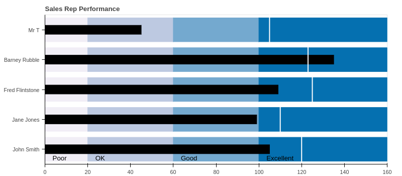
I think this solution is simpler to follow than the matplotlib example. Let’s see if the same is true for the waterfall chart.
Waterfall Chart
I decided to take Bryan’s comments as an opportunity to create a waterfall chart in Bokeh and see how hard (or easy) it is to do. He recommended that the candlestick chart would be a good place to start and I did use that as the basis for this solution. All of the code is in a notebook that is available here.
Let’s start with the Bokeh and pandas imports and enabling the notebook output:
from bokeh.plotting import figure, show
from bokeh.io import output_notebook
from bokeh.models import ColumnDataSource, LabelSet
from bokeh.models.formatters import NumeralTickFormatter
import pandas as pd

output_notebook()
For this solution, I’m going to create a pandas dataframe and use Bokeh’s
ColumnDataSource
to make the code a little simpler. This has the added benefit of making this code
easy to convert to take an Excel input instead of the manually created dataframe.
Feel free to refer to this cheatsheet if you need some help understanding how to create the dataframe as shown below:
# Create the initial dataframe
index = ['sales','returns','credit fees','rebates','late charges','shipping']
data = {'amount': [350000,-30000,-7500,-25000,95000,-7000]}
df = pd.DataFrame(data=data,index=index)

# Determine the total net value by adding the start and all additional transactions
net = df['amount'].sum()
| amount | |
|---|---|
| sales | 350000 |
| returns | -30000 |
| credit fees | -7500 |
| rebates | -25000 |
| late charges | 95000 |
| shipping | -7000 |
The final waterfall code is going to require us to define several additional attributes for each segment including:
- starting position
- bar color
- label position
- label text
By adding this to a single dataframe, we can use Bokeh’s built in capabilities to simplify the final code.
For the next step, we’ll add the running total, segment start location and the position of the label:
df['running_total'] = df['amount'].cumsum()
df['y_start'] = df['running_total'] - df['amount']

# Where do we want to place the label?
df['label_pos'] = df['running_total']
Next, we add a row at the bottom on the dataframe that contains the net value:
df_net = pd.DataFrame.from_records([(net, net, 0, net)],
                                   columns=['amount', 'running_total', 'y_start', 'label_pos'],
                                   index=["net"])
df = df.append(df_net)
For this particular waterfall, I would like to have the negative values a different color and have formatted the labels below the chart. Let’s add columns to the dataframe with the values:
df['color'] = 'grey'
df.loc[df.amount < 0, 'color'] = 'red'
df.loc[df.amount < 0, 'label_pos'] = df.label_pos - 10000
df["bar_label"] = df["amount"].map('{:,.0f}'.format)
Here’s the final dataframe containing all the data we need. It did take some manipulation of the data to get to this state but it is fairly standard pandas code and is easy to debug if something goes awry.
| amount | running_total | y_start | label_pos | color | bar_label | |
|---|---|---|---|---|---|---|
| sales | 350000 | 350000 | 0 | 350000 | grey | 350,000 |
| returns | -30000 | 320000 | 350000 | 310000 | red | -30,000 |
| credit fees | -7500 | 312500 | 320000 | 302500 | red | -7,500 |
| rebates | -25000 | 287500 | 312500 | 277500 | red | -25,000 |
| late charges | 95000 | 382500 | 287500 | 382500 | grey | 95,000 |
| shipping | -7000 | 375500 | 382500 | 365500 | red | -7,000 |
| net | 375500 | 375500 | 0 | 375500 | grey | 375,500 |
Creating the actual plot, is fairly standard Bokeh code since the dataframe has all the values we need:
TOOLS = "box_zoom,reset,save"
source = ColumnDataSource(df)
p = figure(tools=TOOLS, x_range=list(df.index), y_range=(0, net+40000),
           plot_width=800, title = "Sales Waterfall")
By defining the
ColumnDataSource
as our dataframe, Bokeh takes care of creating
all segments and labels without doing any looping.
p.segment(x0='index', y0='y_start', x1="index", y1='running_total',
          source=source, color="color", line_width=55)
We will do some minor formatting to add labels and format the y-axis nicely:
p.grid.grid_line_alpha=0.3
p.yaxis[0].formatter = NumeralTickFormatter(format="($ 0 a)")
p.xaxis.axis_label = "Transactions"
The final step is to add all the labels onto the bars using the
LabelSet
:
labels = LabelSet(x='index', y='label_pos', text='bar_label',
                  text_font_size="8pt", level='glyph',
                  x_offset=-20, y_offset=0, source=source)
p.add_layout(labels)
Here’s the final chart:
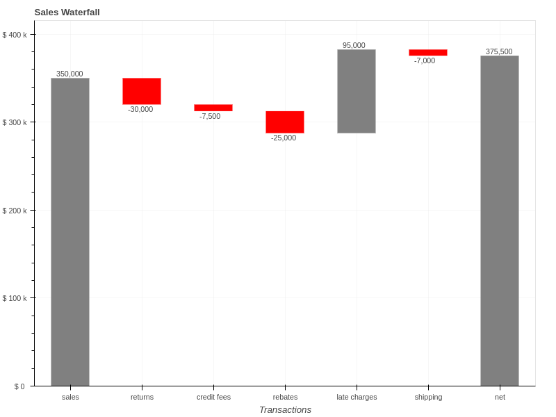
Once again, I think the final solution is simpler than the matplotlib code and the resulting output looks pleasing. You also have the added bonus that the charts are interactive and could be enhanced even more by using the Bokeh server (see my Australian Wine Ratings article for an example). The code should also be straightforward to modify for your specific datasets.
Summary
I appreciate that Bryan took the time to offer the suggestion to build these plots in Bokeh. This exercise highlighted for me that Bokeh is very capable of building custom charts that I would normally create with matplotlib. I will continue to evaluate options and post updates here as I learn more. Feel free to comment below if you find this useful.
Comments