Creating a Waterfall Chart in Python
Posted by Chris Moffitt in articles
Introduction
Waterfall charts can be a really useful tool to for certain types of data plotting. Not surprisingly, we can use pandas and matplotlib to create a repeatable waterfall chart.
Before I go any further, I want to level set with everyone about which type of chart I’m referring to. I will be building a 2-D waterfall chart described in this wikipedia article.
A fairly typical use for a chart such as this is to show what the + and - values are that “bridge” between a start and end value. For this reason, finance folks will sometimes refer to this as a bridge. Like the other examples I’ve used, this type of plot is not easy to generate in Excel. There are certainly ways to do it but it is not easy to remember.
The key thing to keep in mind with a waterfall chart is: at its heart it is a stacked bar chart. The “special sauce” is that you have a blank bottom bar so the top bar “floats” in space. Let’s get started.
Creating the Chart
Execute the standard imports and make sure IPython will display matplot plots.
import numpy as np
import pandas as pd
import matplotlib.pyplot as plt
%matplotlib inline
Setup the data we want to waterfall chart and load it into a dataframe.
The data needs to start with your starting value but you leave out the final total. We will calculate it.
index = ['sales','returns','credit fees','rebates','late charges','shipping']
data = {'amount': [350000,-30000,-7500,-25000,95000,-7000]}
trans = pd.DataFrame(data=data,index=index)
I am using the handy
display
function in IPython to make it easier to control what I want to display.
from IPython.display import display
display(trans)
| amount | |
|---|---|
| sales | 350000 |
| returns | -30000 |
| credit fees | -7500 |
| rebates | -25000 |
| late charges | 95000 |
| shipping | -7000 |
The biggest trick with a waterfall plot is figuring out what the bottom stacked bar chart should be. I learned a lot from this stackoverflow discussion
First, let’s get the cumulative sum.
display(trans.amount.cumsum())
sales           350000
returns         320000
credit fees     312500
rebates         287500
late charges    382500
shipping        375500
Name: amount, dtype: int64
This looks good but we need to shift the data one place to the right.
blank=trans.amount.cumsum().shift(1).fillna(0)
display(blank)
sales                0
returns         350000
credit fees     320000
rebates         312500
late charges    287500
shipping        382500
Name: amount, dtype: float64
We need to add a net total amount to the
trans
and
blank
dataframe.
total = trans.sum().amount
trans.loc["net"] = total
blank.loc["net"] = total
display(trans)
display(blank)
| amount | |
|---|---|
| sales | 350000 |
| returns | -30000 |
| credit fees | -7500 |
| rebates | -25000 |
| late charges | 95000 |
| shipping | -7000 |
| net | 375500 |
sales                0
returns         350000
credit fees     320000
rebates         312500
late charges    287500
shipping        382500
net             375500
Name: amount, dtype: float64
Create the steps we use to show the changes.
step = blank.reset_index(drop=True).repeat(3).shift(-1)
step[1::3] = np.nan
display(step)
0         0
0       NaN
0    350000
1    350000
1       NaN
1    320000
2    320000
2       NaN
2    312500
3    312500
3       NaN
3    287500
4    287500
4       NaN
4    382500
5    382500
5       NaN
5    375500
6    375500
6       NaN
6       NaN
Name: amount, dtype: float64
For the net row, we need to make sure the blank value is 0 so we don’t double stack.
blank.loc["net"] = 0
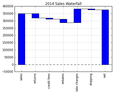
Plot it and see what it looks like
my_plot = trans.plot(kind='bar', stacked=True, bottom=blank,legend=None, title="2014 Sales Waterfall")
my_plot.plot(step.index, step.values,'k')
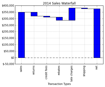
That looks pretty good but let’s try formatting the y-axis to make it
more readable. We use
FuncFormatter
and some of the python 2.7+ syntax
to truncate decimals and add a comma to the format.
def money(x, pos):
    'The two args are the value and tick position'
    return "${:,.0f}".format(x)
from matplotlib.ticker import FuncFormatter
formatter = FuncFormatter(money)
Pull it all together
my_plot = trans.plot(kind='bar', stacked=True, bottom=blank,legend=None, title="2014 Sales Waterfall")
my_plot.plot(step.index, step.values,'k')
my_plot.set_xlabel("Transaction Types")
my_plot.yaxis.set_major_formatter(formatter)
Full Script
The basic graph works but I wanted to add labels and make some minor formatting changes. Here is my final script:
import numpy as np
import pandas as pd
import matplotlib.pyplot as plt
from matplotlib.ticker import FuncFormatter

#Use python 2.7+ syntax to format currency
def money(x, pos):
    'The two args are the value and tick position'
    return "${:,.0f}".format(x)
formatter = FuncFormatter(money)

#Data to plot. Do not include a total, it will be calculated
index = ['sales','returns','credit fees','rebates','late charges','shipping']
data = {'amount': [350000,-30000,-7500,-25000,95000,-7000]}

#Store data and create a blank series to use for the waterfall
trans = pd.DataFrame(data=data,index=index)
blank = trans.amount.cumsum().shift(1).fillna(0)

#Get the net total number for the final element in the waterfall
total = trans.sum().amount
trans.loc["net"]= total
blank.loc["net"] = total

#The steps graphically show the levels as well as used for label placement
step = blank.reset_index(drop=True).repeat(3).shift(-1)
step[1::3] = np.nan

#When plotting the last element, we want to show the full bar,
#Set the blank to 0
blank.loc["net"] = 0

#Plot and label
my_plot = trans.plot(kind='bar', stacked=True, bottom=blank,legend=None, figsize=(10, 5), title="2014 Sales Waterfall")
my_plot.plot(step.index, step.values,'k')
my_plot.set_xlabel("Transaction Types")

#Format the axis for dollars
my_plot.yaxis.set_major_formatter(formatter)

#Get the y-axis position for the labels
y_height = trans.amount.cumsum().shift(1).fillna(0)

#Get an offset so labels don't sit right on top of the bar
max = trans.max()
neg_offset = max / 25
pos_offset = max / 50
plot_offset = int(max / 15)

#Start label loop
loop = 0
for index, row in trans.iterrows():
    # For the last item in the list, we don't want to double count
    if row['amount'] == total:
        y = y_height[loop]
    else:
        y = y_height[loop] + row['amount']
    # Determine if we want a neg or pos offset
    if row['amount'] > 0:
        y += pos_offset
    else:
        y -= neg_offset
    my_plot.annotate("{:,.0f}".format(row['amount']),(loop,y),ha="center")
    loop+=1

#Scale up the y axis so there is room for the labels
my_plot.set_ylim(0,blank.max()+int(plot_offset))
#Rotate the labels
my_plot.set_xticklabels(trans.index,rotation=0)
my_plot.get_figure().savefig("waterfall.png",dpi=200,bbox_inches='tight')
Running the script will generate this nice looking chart:
Final Thoughts
If you were not familiar with waterfall charts, hopefully this example will show you how useful they can be. I imagine that some people may think that this is an awful lot of scripting for one chart. I agree - in some respects. If you will only do one waterfall chart and never touch it again - stick with an Excel solution.
However, what if the chart is really useful and now you need to replicate it for 100 customer? What would you do next? Using Excel would be a challenge. Using this script to create 100 different charts would be fairly easy. Once again, the real value of this process is building an easily repeatable process when you need to scale the solution.
I am really enjoying learning more about pandas, matplotlib and IPython. I am pretty happy with how this solution has turned out and I hope others can learn a little bit too and apply this lessons to their daily jobs.
Updates
7-May-2018: An example via Bokeh is now available in this post.
Comments