Creating Interactive Dashboards from Jupyter Notebooks
Posted by Duarte O.Carmo in articles
Introduction
I am pleased to have another guest post from Duarte O.Carmo. He wrote series of posts in July on report generation with Papermill that were very well received. In this article, he will explore how to use Voilà and Plotly Express to convert a Jupyter notebook into a standalone interactive web site. In addition, this article will show examples of collecting data through an API endpoint, performing sentiment analysis on that data and show multiple approaches to deploying the dashboard.
About Duarte
Hey everyone! My name is Duarte O.Carmo and I’m a Consultant working
at Jabra that loves working with python and data. Make sure to visit my
website if you want to find more about me 
Since this is a long article, here are the table of contents for easier navigation:
The Goal
Jupyter notebooks are one of my favorite tools to work with data, they are simple to use, fast to set up, and flexible. However, they do have their disadvantages: source control, collaboration, and reproducibility are just some of them. As I illustrated in my prior post, I tend to enjoy seeing what I can accomplish with them.
An increasing need is the sharing of our notebooks. Sure, you can export your notebooks to html, pdf, or even use something like nbviewer to share them. But what if your data changes constantly? What if every time you run your notebook, you expect to see something different? How can you go about sharing something like that?
But what if your data changes constantly? What if every time you run your notebook, you expect to see something different? How can you go about sharing something like that?
In this article, I’ll show you how to create a Jupyter Notebook that fetches live data, builds an interactive plot and then how to deploy it as a live dashboard. When you want to share the dashboard, all you need to share with someone is a link.
Let’s have some fun with the data first.
Getting live Reddit data
We will use Reddit as the source of data for our dashboard. Reddit is a tremendous source of information, and there are a million ways to get access to it. One of my favorite ways to access the data is through a small API called pushshift. The documentation is right here.
Let’s say you wanted the most recent comments mentioning the word “python”. In python, you could use requests to get a json version of the data:
import requests
url = "https://api.pushshift.io/reddit/search/comment/?q=python"
request = requests.get(url)
json_response = request.json()
You can add a multitude of parameters to this request, such as:
- in a certain subreddit
- after a certain day
- sorted by up votes
- many more
To make my life easier, I built a function that allows me to call this API as a function:
def get_pushshift_data(data_type, **kwargs):
    """
    Gets data from the pushshift api.

    data_type can be 'comment' or 'submission'
    The rest of the args are interpreted as payload.

    Read more: https://github.com/pushshift/api
    """

    base_url = f"https://api.pushshift.io/reddit/search/{data_type}/"
    payload = kwargs
    request = requests.get(base_url, params=payload)
    return request.json()
Using the
payload
parameter and
kwargs
I can then add any payload I wish as a function. For example,
get_pushshift_data(data_type="comment",     # give me comments
                   q="python",              # that mention 'python'
                   after="48h",             # in the last 48 hours
                   size=1000,               # maximum 1000 comments
                   sort_type="score",       # sort them by score
                   sort="desc")             # sort descending
returns the json response. Pretty sweet right?
Analyzing the data with Plotly Express
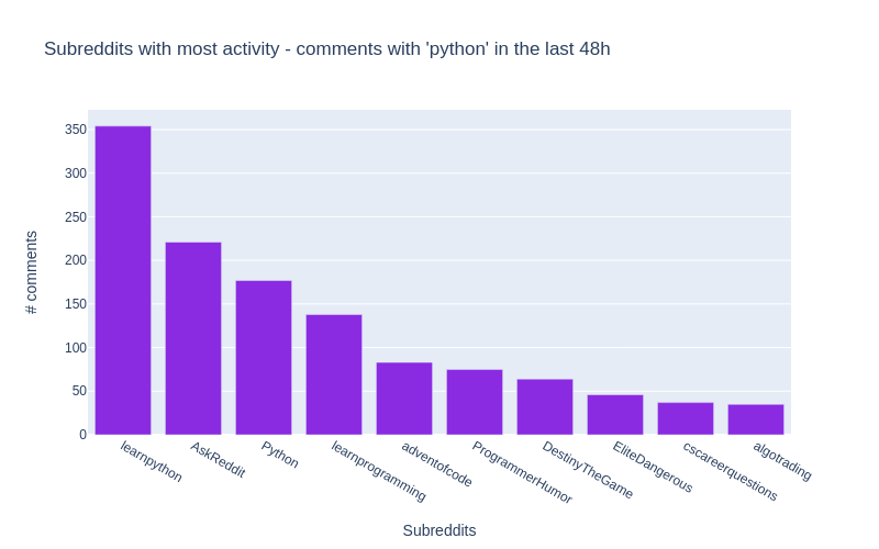
In what subreddits does the word ‘python’ appear more?
To answer the above question, we start by getting the data with our function:
data = get_pushshift_data(data_type="comment",
                          q="python",
                          after="48h",
                          size=1000,
                          aggs="subreddit")
The
aggs
keyword asks pushshift to return an aggregation into subreddits, which basically means, group the results by subreddit.
(read about it in the documentation)
Since the json response is pretty nested, we’ll need to navigate a bit inside of the dictionary.
data = data.get("aggs").get("subreddit")
And we transform the list of dictionaries returned into a pandas DataFrame, and get the top 10.
df = pandas.DataFrame.from_records(data)[0:10]
Here’s what our DataFrame looks like:
| doc_count | key | |
|---|---|---|
| 0 | 352 | learnpython |
| 1 | 220 | AskReddit |
| 2 | 177 | Python |
| 3 | 139 | learnprogramming |
These are the names of the subreddits where the word
python
appears most frequently in their comments  !
!
Let’s plot our results with the Ploty Express library. Plotly Express is great, in my opinion, if you want to:
- create figures quickly.

- create figures that are a bit more interactive than matplotlib.

- don’t mind a bit more installation and (imo) a bit less documentation.

Here’s all the code you need:
import plotly.express as px

px.bar(df,              # our dataframe
       x="key",         # x will be the 'key' column of the dataframe
       y="doc_count",   # y will be the 'doc_count' column of the dataframe
       title=f"Subreddits with most activity - comments with 'python' in the last 48h",
       labels={"doc_count": "# comments","key": "Subreddits"}, # the axis names
       color_discrete_sequence=["blueviolet"], # the colors used
       height=500,
       width=800)
Yes, perhaps a bit more verbose than matplotlib, but you get an interactive chart!
All of the details are included in the notebook for this article.
What are the most up-voted comments with the word ‘python’?
To answer this question, our function will again come in handy. Let’s aggregate things a bit.
Don’t get scared, this is a one liner that will produce similar results to above:
# get the data we need using the function
data = get_pushshift_data(data_type="comment", q="python", after="7d", size=10, sort_type="score", sort="desc").get("data")

# we only care about certain columns
df = pandas.DataFrame.from_records(data)[["author", "subreddit", "score", "body", "permalink"]]

# we only keep the first X characters of the body of the comment (sometimes they are too big)
df['body'] = df['body'].str[0:400] + "..."

# we append the string to all the permalink entries so that we have a link to the comment
df['permalink'] = "https://reddit.com" + df['permalink'].astype(str)

# style the last column to be clickable and print
df.style.format({'permalink': make_clickable})
To make a DataFrame column clickable you can can apply the following function to it:
def make_clickable(val):
    """ Makes a pandas column clickable by wrapping it in some html.
    """
    return '<a href="{}">Link</a>'.format(val,val)
The above code will return the top 10 most upvoted comments of the last 7 days:
| author | subreddit | sc or e | body | permalink | |
|---|---|---|---|---|---|
| 0 | Saiboo | learnpyth on | 11 1 | Suppose you create the following python file calle… | Link |
| 1 | Kompakt | Programme rHumor | 92 | Some languages don’t have switch statements…look… | Link |
| 2 | clown_ world_ 2020 | MrRobot | 47 | Just goes to show that Esmail isn’t the only brill… | Link |
| 3 | Leebert ysauce | AnimalsBe ingBros | 28 | They wont even be mad when the python decide to ta… | Link |
| 4 | Kompakt | Programme rHumor | 23 | Yep it’s true, and depending on the design of the … | Link |
| 5 | niceboy 4431 | Cringetop ia | 23 | I have a theory (someone prove me wrong if you kno… | Link |
| 6 | kinggur u | Denmark | 22 | Brug af Python: +1 Brug af Python 3: +2 … | Link |
| 7 | MintyAr oma | totalwar | 20 | We really need Bretonnian Men-At-Arms shouting Mon… | Link |
| 8 | aspirin gtobeme | gifsthatk eepongivi ng | 19 | Amazing. Brought [this Monty Python clip](… | Link |
| 9 | Crimson Spooker | TwoBestFr iendsPlay | 19 | “Why can’t Three Houses be gritty and “realistic” … | Link |
In the notebook, you can click the link column to be taken right into the comment. Hooray!
What is the sentiment in /r/python across time? Introducing TextBlob
Alright, the final analysis is a bit more complicated. We want to see the sentiment in the /r/python subreddit in some sort of time line.
First, we already now how to retrieve the most up voted comments of the past 2 days:
# get the data with our function
data = get_pushshift_data(data_type="comment",
                          after="2d",
                          size=1000,
                          sort_type="score",
                          sort="desc",
                          subreddit="python").get("data")

# define a list of columns we want to keep
columns_of_interest = ["author", "body", "created_utc", "score", "permalink"]

# transform the response into a dataframe
df = pandas.DataFrame.from_records(data)[columns_of_interest]
This gives us a pandas DataFrame with the columns specified in
columns_of_interest
. But how do we get the sentiment of
every comment?
Enter TextBlob. A simple library that makes it ridiculously easy to get the sentiment of a sentence. Textblob returns two values, the sentiment polarity (-1 is negative; 0 is neutral; and 1 is positive) and the sentiment subjectivity (0 is objective and 1 is subjective)
Here’s an example:
import textblob

sentence1 = "Portugal is a horrible country. People drive like crazy animals."
print(textblob.TextBlob(sentence1).sentiment)
# -> Sentiment(polarity=-0.8, subjectivity=0.95)
# negative and subjective

sentence2 = "Portugal is the most beautiful country in the world because beaches face west."
print(textblob.TextBlob(sentence2).sentiment)
# -> Sentiment(polarity=0.675, subjectivity=0.75)
# positive and less subjective
Read more about the library here.
Now that we know how to extract sentiment from a piece of text, we can easily create some other columns for our DataFrame of comments:
# create a column with sentiment polarity
df["sentiment_polarity"] = df.apply(lambda row: textblob.TextBlob(row["body"]).sentiment.polarity, axis=1)

# create a column with sentiment subjectivity
df["sentiment_subjectivity"] = df.apply(lambda row: textblob.TextBlob(row["body"]).sentiment.subjectivity, axis=1)

# create a column with 'positive' or 'negative' depending on sentiment_polarity
df["sentiment"] = df.apply(lambda row: "positive" if row["sentiment_polarity"] >= 0 else "negative", axis=1)

# create a column with a text preview that shows the first 50 characters
df["preview"] = df["body"].str[0:50]

# take the created_utc parameter and tranform it into a datetime column
df["date"] = pandas.to_datetime(df['created_utc'],unit='s')
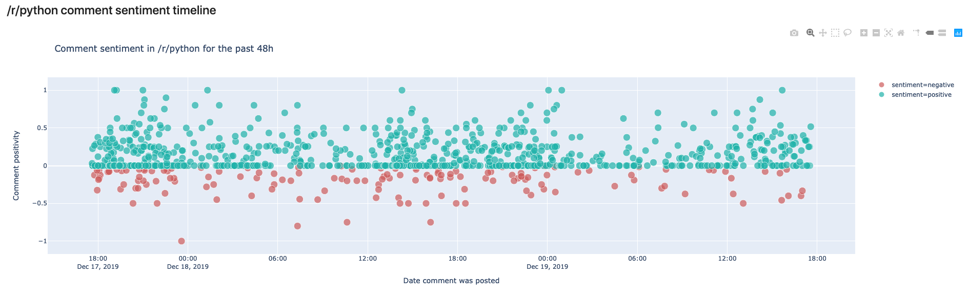
Finally, it’s time to plot our figure with the help of Plotly Express:
px.scatter(df, x="date", # date on the x axis
               y="sentiment_polarity", # sentiment on the y axis
               hover_data=["author", "permalink", "preview"], # data to show on hover
               color_discrete_sequence=["lightseagreen", "indianred"], # colors to use
               color="sentiment", # what should the color depend on?
               size="score", # the more votes, the bigger the circle
               size_max=10, # not too big
               labels={"sentiment_polarity": "Comment positivity", "date": "Date comment was posted"}, # axis names
               title=f"Comment sentiment in /r/python for the past 48h", # title of figure
          )
And here’s the output!
In this view, we can see the comments made in /r/python in the last 48 hours. We can see that most comments are rather on the positive side, but some are also negative. In your own notebook you’ll notice that you can hover over the comments and read the preview to see why they were classified as negative or positive.
The cool thing here is that if you run the same script tomorrow, you’ll get a different output.
So how can we have this in some place that “automatically” is updated whenever we see it?
Creating a live dashboard with Voilà
Voilà has a simple premise: “Voilà turns Jupyter notebooks into standalone web applications.”
Let’s back up a bit, and get everything you need running in your system. First step is to have a working setup with everything above, for that, follow these instructions .
Once that is done, you should be able to launch the dashboard with:
(env) $ voila notebooks/Dashboard.ipynb
Now, you should be able to see a web like application in a new tab in your browser from the notebook we created!
Feel free to modify this notebook according to your interests. You’ll notice that I have created some general variables in the first notebook cell, so you can fire up Jupyter Lab, and modify them and see what comes out!
Here are the general modifiable cells:
COMMENT_COLOR         = "blueviolet"    # color for your comment graph
SUBMISSION_COLOR      = "darkorange"    # color for your submission graph
TEXT_PREVIEW_SIZE     = 240             # how long should the preview be?
TERM_OF_INTEREST      = "python"        # maybe you are interested in some other term?
SUBREDDIT_OF_INTEREST = "python"        # maybe you are interested in some other subreddit?
TIMEFRAME             = "48h"           # you can define another timeline
Once you have modified your dashboard, you can launch Voilà again to see the results.
The most important thing about Voilà is that every time it runs, it actually re-runs your whole code, which yes, makes things a bit slow, but also means that the results get updated every time the page is refreshed! :tada:
Deploying your notebook to the web
First option: Using binder
Binder helps you turn a simple GitHub repo into an interactive notebook environment. They do this by using docker images to reproduce your GitHub repo’s setup.
We don’t really care about all that. We just want to publish our Voilà dashboard. To do that, follow these steps:
- Create a public GitHub repo
- Add the notebooks you want to publish as dashboards to it
- Add a
requirements.txtfile just as I have in the example repo with all of your dependencies. - Go to mybinder.org
- In the
GitHubfield add your repo’s URL. - In the
GitHub branch, tag, or commitfield, add “master”, otherwise, you probably know what you are doing. - In the
Path to a notebook fieldadd/voila/render/path/to/notebook.ipynbthepath/to/rendershould be the location of your notebook in your repo. In the example, this results invoila/render/notebooks/Dashboard.ipynb - In the
Path to a notebook fieldtoggleURL(instead of the defaultfileoption) - Hit
launch - Your dashboard will automatically launch :open_mouth: :tada:
- You can share the link with others and they will have access to the dashboard as well.
Here is the running example of our reddit dashboard. (Takes a bit to build for the first time..)
Second Option: Using an ubuntu server in a hacky way with tmux 
WARNING: This option is not 100% safe, so make sure to only use it for testing or proof of concepts, particularly if you are dealing with sensitive data!
If you want to have your dashboard running on a typical URL (such as mycooldash.com for example), you probably want to deploy it on a Linux server.
Here are the steps I used to accomplish that:
- Set up your virtual private server - this Linode guide is a good start.
- Make sure port 80 (the regular http port) is open
$ sudo iptables -A INPUT -p tcp --dport 80 -j ACCEPT
- Once you have your repo in GitHub or somewhere else, clone it to your server.
$ git clone https://github.com/your_username/your_awesome_repo.git
- You should already have python 3 installed. Try typing
python3in your console. If that fails then these instructions will help you. - Make sure you can run your dashboard, by creating a virtual environment and installing the dependencies.
- Now, if you type in your console the Voilà command, and specify the port:
(env) $ voila YourNoteBook.ipynb --port=80
You can probably navigate to your server’s IP and see the dashboard. However, as soon as you exit your server, your dashboard will stop working. We are going to use a nifty trick with a tool called tmux.
Tmux is a “terminal multiplexer” (wow, that’s a big word). It basically allows us to create multiple terminal sessions at the same time, and then (yes you guessed it), keep them running indefinitely. If this sounds confusing, let’s just get to it.
- Install tmux:
$ sudo apt-get install tmux
- Once installed we create a new terminal session:
$ tmux new voila
- You are now inside a new terminal session. Let’s get Voilà running there.
$ cd my_repo            # navigate to the repo
$ . env/bin/activate    # activate the environment
(env) $ voila MyNotebook.ipynb --port=80 # start the dashboard on port 80
- You should see the dashboard in your browser
- And now, for the magic, in your terminal hit
ctrl+band thendon your keyboard. This will “detach” you from that terminal where Voilà is running. - You are now back to your original terminal session. Notice that your dashboard is still running. This is because your
voilaterminal session is still running. - You can see it by listing the terminal sessions with:
$ tmux ls
- And then attach to it via:
$ tmux attach voila
- And you’ll see your Voilà logs outputting.
This is arguably a bit of a hack to have things running, but it works - so no complaints there.
Tmux is an awesome tool, and you should definitely learn more about it here.
Using Heroku or Google Cloud Platform
There are a million ways of deploying, and Voilà also has good documentation on these.
Conclusion
That was a long post! But we are finally done! Let’s summarize everything we learned:
- We learned how to transform an API endpoint into a function with
*kwargs - We learned how to analyze reddit data with python and Plotly Express
- We learned how to analyze sentiment from sentences with TextBlob
- We learned how to transform a jupyter notebook into a dashboard using Voilà.
- We learned how to deploy those dashboards with Binder.org
- We learned how to use tmux to deploy these kinds of tools in a server.
That was a lot of stuff, and probably there are a lot of bugs in my notebook, or explanation so make sure to:
- Visit the GitHub repo were both the code and post are stored.
- If there is something wrong in the code please feel free to submit an issue or a pull request.
- Tweet at me if you have questions!
- Visit my website if you want to learn more about my work
Hope you enjoyed it!
Comments