Visualizing Google Forms Data with Seaborn
Posted by Chris Moffitt in articles
Introduction
This is the second article in a series describing how to use Google Forms to collect information via simple web forms, read it into a pandas dataframe and analyze it. This article will focus on how to use the data in the dataframe to create complex and powerful data visualizations with seaborn.
If you have not read the previous article please give it a quick glance so you understand the background. To give you an idea of what this article will cover, here is a snapshot of the images we will be creating:

A Word About Seaborn
Before getting too deep into the article, I think it is important to give a quick word about seaborn. The seaborn introduction gives more details, including this section:
Seaborn aims to make visualization a central part of exploring and understanding data. The plotting functions operate on dataframes and arrays containing a whole dataset and internally perform the necessary aggregation and statistical model-fitting to produce informative plots. Seaborn’s goals are similar to those of R’s ggplot, but it takes a different approach with an imperative and object-oriented style that tries to make it straightforward to construct sophisticated plots. If matplotlib “tries to make easy things easy and hard things possible”, seaborn aims to make a well-defined set of hard things easy too.
If, like me, your primary exposure to visualization tools is Excel, then this mindset is a bit foreign. As I work with seaborn, I sometimes fight with it when I try to treat it like creating an Excel chart. However, once I started to produce some impressive plots with seaborn, I started to “get it.” There is no doubt I am still learning. One thing I have found, though, is that if you are in a business setting where everyone sees the normal (boring) Excel charts, they will think you’re a genius once you show them some of the output from seaborn!
The rest of this article will discuss how to visualize the survey results with seaborn and use the complex visualization to gain insights into the data.
Wrangling the Data
In addition to this article, a more detail notebook is hosted in the github repo.
Here is the relevant code to connect to the google form and create the dataframe:
import gspread
from oauth2client.client import SignedJwtAssertionCredentials
import pandas as pd
import json
import matplotlib.pyplot as plt
import seaborn as sns

SCOPE = ["https://spreadsheets.google.com/feeds"]
SECRETS_FILE = "Pbpython-key.json"
SPREADSHEET = "PBPython User Survey (Responses)"
# Based on docs here - http://gspread.readthedocs.org/en/latest/oauth2.html
# Load in the secret JSON key (must be a service account)
json_key = json.load(open(SECRETS_FILE))
# Authenticate using the signed key
credentials = SignedJwtAssertionCredentials(json_key['client_email'],
                                            json_key['private_key'], SCOPE)
gc = gspread.authorize(credentials)
# Open up the workbook based on the spreadsheet name
workbook = gc.open(SPREADSHEET)
# Get the first sheet
sheet = workbook.sheet1
# Extract all data into a dataframe
results = pd.DataFrame(sheet.get_all_records())
Please refer to the notebook for some more details on what the data looks like.
Since the column names are so long, let’s clean those up and and convert the timestamp to a date time.
# Do some minor cleanups on the data
# Rename the columns to make it easier to manipulate
# The data comes in through a dictionary so we can not assume order stays the
# same so must name each column
column_names = {'Timestamp': 'timestamp',
                'What version of python would you like to see used for the examples on the site?': 'version',
                'How useful is the content on practical business python?': 'useful',
                'What suggestions do you have for future content?': 'suggestions',
                'How frequently do you use the following tools? [Python]': 'freq-py',
                'How frequently do you use the following tools? [SQL]': 'freq-sql',
                'How frequently do you use the following tools? [R]': 'freq-r',
                'How frequently do you use the following tools? [Javascript]': 'freq-js',
                'How frequently do you use the following tools? [VBA]': 'freq-vba',
                'How frequently do you use the following tools? [Ruby]': 'freq-ruby',
                'Which OS do you use most frequently?': 'os',
                'Which python distribution do you primarily use?': 'distro',
                'How would you like to be notified about new articles on this site?': 'notify'
                }
results.rename(columns=column_names, inplace=True)
results.timestamp = pd.to_datetime(results.timestamp)
The basic data is a little easier to work with now.
Looking at the Suggestions
The first thing we’ll look at is the free form suggestions. Since there are only a small number of free form comments, let’s strip those out and remove them from the results.
suggestions = results[results.suggestions.str.len() > 0]["suggestions"]
Since there are only a small number of comments, just print them out.
However, if we had more comments and wanted to do more analysis we
certainly could. I’m using
display
for the purposes of formatting the
output for the notebook.
for index, row in suggestions.iteritems():
    display(row)
A bit more coverage on how to make presentations - which in a lot of corporations just means powerpoint slides with python, from a business analyst perspective, of course
Add some other authors to the website which can publish equally relevant content. Would  be nice to see more frequent updates if possible, keep up the good work!
How to produce graphics using Python, Google Forms.
Awesome site - keep up the good work
Great job on the site.  Nice to see someone writing about actual Python use cases. So much writing is done elsewhere about software development without the connection to actual business work.
Drop the suggestions. We won’t use them any more.
results.drop("suggestions", axis=1, inplace=True)
I do think it is interesting that several suggestions relate to graphics/presentations so hopefully this article will be helpful.
Explore the Data
Before we start plotting anything, let’s see what the data tells us:
results.describe()
| useful | |
|---|---|
| count | 53.000000 |
| mean | 2.037736 |
| std | 0.783539 |
| min | 1.000000 |
| 25% | 1.000000 |
| 50% | 2.000000 |
| 75% | 3.000000 |
| max | 3.000000 |
Because we only have 1, 2, 3 as options the numeric results aren’t
telling us that much. I am going to convert the number to more useful
descriptions using
map
. This change will be useful when we plot the data.
results['useful'] = results['useful'].map({1: '1-low', 2: '2-medium', 3: '3-high'})
results.head()
Value counts give us an easy distribution view into the raw numbers.
results["version"].value_counts()
2.7             22
3.4+            18
I don't care    13
dtype: int64
Use
normalize
to see it by percentage.
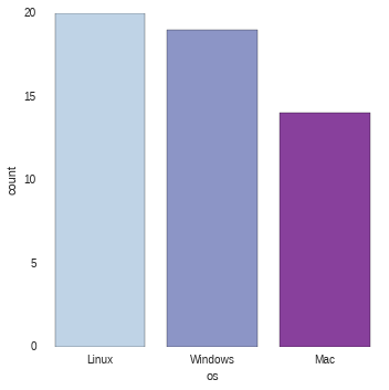
results.os.value_counts(normalize=True)
Linux      0.377358
Windows    0.358491
Mac        0.264151
dtype: float64
While the numbers are useful, wouldn’t it be nicer to visually show the results?
Seaborn’s factorplot is helpful for showing this kind of categorical data.
Because factorplot is so powerful, I’ll build up step by step to show how it can be used for complex data analysis.
First, look at number of users by OS.
sns.factorplot("os", data=results, palette="BuPu")

It is easy to order the results using
x_order
sns.factorplot("os", x_order=["Linux", "Windows", "Mac"], data=results, palette="BuPu")
This is useful but wouldn’t it be better to compare with OS and preferred python
version? This is where factorplot starts to show more versatility. The key
component is to use
hue
to automatically slice the data by python version (in this case).
sns.factorplot("os", hue="version", x_order=["Linux", "Windows", "Mac"], data=results, palette="Paired")

Because seaborn knows how to work with dataframes, we just need to pass in the column names for the various arguments and it will do the analysis and presentation.
How about if we try to see if there is any relationship between how useful the site
is and OS/Python choice? We can add the useful column into the plot using
col
.
sns.factorplot("version", hue="os", data=results, col="useful", palette="Paired")

The final view will include layering in the Anaconda and Official python.org binaries. I have cleaned up the data and filtered the results to include only these two distros:
results_distro = results[results["distro"].isin(["Anaconda", "Official python.org binaries"])]
Now do the factor plot showing multiple columns and rows of data using
row
and
col
sns.factorplot("version", hue="os", data=results_distro, col="useful", row="distro", margin_titles=True, sharex=False)

Once you get used to how to use factorplots, I think you will really be impressed with their versatility and power. You probably also noticed that I used different palettes in the graphs. I did this on purpose to show how much change can be made by tweaking and changing the palettes.
Response Over Time
Another useful view into the data is looking at the responses over time.
The seaborn’s timeseries supports this type of analysis and much more.
For ease of calculating responses over time, add a count colum for each response and set the timestamp as our index.
results["count"] = 1
total_results = results.set_index('timestamp')
The magic happens by using
TimeGrouper
to group by day. We can easily
group by any arbirtray time period using this code:
running_results = total_results.groupby(pd.TimeGrouper('D'))["count"].count().cumsum()
running_results
timestamp
2015-06-09     1
2015-06-10    17
2015-06-11    22
2015-06-12    26
2015-06-13    27
2015-06-14    30
2015-06-15    33
2015-06-16    34
2015-06-17    35
2015-06-18    41
2015-06-19    46
2015-06-20    49
2015-06-21    49
2015-06-22    50
2015-06-23    51
2015-06-24    52
2015-06-25    52
2015-06-26    53
Freq: D, Name: count, dtype: int64
To label the x-axis we need to define our time range as a series from 0 to the max number of days.
step = pd.Series(range(0,len(running_results)), name="Days")
sns.tsplot(running_results, value="Total Responses", time=step, color="husl")

Seaborn timeseries are really meant to do so much more but this was a simple view of how it could be applied to this case. It is pretty clear that responses jumped up when the article was published then again when it was re-tweeted by others.
Heatmaps and Clustermaps
The final section of data to analyze is the frequency readers are using different technology. I am going to use a heatmap to look for any interesting insights. This is a really useful plot that is not that commonly used in an environment where Excel rules the data presentation space.
Let’s look at the data again. The trick is going to be getting it formatted in the table structure that heatmap expects.
results.head()
| freq-js | freq-py | freq-r | freq-ruby | freq-sql | freq-vba | useful | notify | timestamp | version | os | distro | count | |
|---|---|---|---|---|---|---|---|---|---|---|---|---|---|
| 0 | Once a month | A couple times a week | Infrequently | Never | Once a month | Never | 3-high | RSS | 2015-06-09 23:22:43 | 2.7 | Mac | Included with OS - Mac | 1 |
| 1 | Once a month | Daily | A couple times a week | Never | Infrequently | Infrequently | 3-high | 2015-06-10 01:19:08 | 2.7 | Windows | Anaconda | 1 | |
| 2 | Infrequently | Daily | Once a month | Never | Daily | Never | 2-medium | Planet Python | 2015-06-10 01:40:29 | 3.4+ | Windows | Official python.org binaries | 1 |
| 3 | Never | Daily | Once a month | Never | A couple times a week | Once a month | 3-high | Planet Python | 2015-06-10 01:55:46 | 2.7 | Mac | Official python.org binaries | 1 |
| 4 | Once a month | Daily | Infrequently | Infrequently | Once a month | Never | 3-high | Leave me alone - I will find it if I need it | 2015-06-10 04:10:17 | I don’t care | Mac | Anaconda | 1 |
Break the data down to see an example of the distribution:
results["freq-py"].value_counts()
Daily                    34
A couple times a week    15
Once a month              3
                          1
dtype: int64
What we need to do is construct a single DataFrame with all the
value_counts
for the specific technology. First we will create a list
containing each value count.
all_counts = []
for tech in ["freq-py", "freq-sql", "freq-r", "freq-ruby", "freq-js", "freq-vba"]:
    all_counts.append(results[tech].value_counts())
display(all_counts)
[Daily                    34
 A couple times a week    15
 Once a month              3
                           1
 dtype: int64, A couple times a week    17
 Infrequently             13
 Daily                    12
 Never                     5
 Once a month              4
                           2
 dtype: int64, Never                    23
 Infrequently             15
 Once a month              5
 Daily                     4
                           3
 A couple times a week     3
 dtype: int64, Never           44
 Infrequently     6
                  2
 Once a month     1
 dtype: int64, Never                    18
 Once a month             15
 Infrequently             11
 Daily                     5
 A couple times a week     3
                           1
 dtype: int64, Never           37
 Infrequently     6
 Once a month     5
 Daily            3
                  2
 dtype: int64]
Now, concat the lists along axis=1 and fill in any nan values with 0.
tech_usage = pd.concat(all_counts, keys=["Python", "SQL", "R", "Ruby", "javascript", "VBA"], axis=1)
tech_usage = tech_usage.fillna(0)
tech_usage
| Python | SQL | R | Ruby | javascript | VBA | |
|---|---|---|---|---|---|---|
| 1 | 2 | 3 | 2 | 1 | 2 | |
| A couple times a week | 15 | 17 | 3 | 0 | 3 | 0 |
| Daily | 34 | 12 | 4 | 0 | 5 | 3 |
| Infrequently | 0 | 13 | 15 | 6 | 11 | 6 |
| Never | 0 | 5 | 23 | 44 | 18 | 37 |
| Once a month | 3 | 4 | 5 | 1 | 15 | 5 |
We have a nice table but there are a few problems.
First, we have one column with blank values that we don’t want.
Secondly, we would like to order from Daily -> Never. Use
reindex
to
accomplish both tasks.
tech_usage = tech_usage.reindex(["Daily", "A couple times a week", "Once a month", "Infrequently", "Never"])
| Python | SQL | R | Ruby | javascript | VBA | |
|---|---|---|---|---|---|---|
| Daily | 34 | 12 | 4 | 0 | 5 | 3 |
| A couple times a week | 15 | 17 | 3 | 0 | 3 | 0 |
| Once a month | 3 | 4 | 5 | 1 | 15 | 5 |
| Infrequently | 0 | 13 | 15 | 6 | 11 | 6 |
| Never | 0 | 5 | 23 | 44 | 18 | 37 |
That was a lot of work but now that the data is in the correct table format, we can create a heatmap very easily:
sns.heatmap(tech_usage, annot=True)

So, what does this tell us?
Not surprisingly, most people use python very frequently.
Additionally, it looks like very few survey takers are using Ruby or VBA.
A variation of the heatmap is the clustermap. The main feature is that it tries to reorganize the data to more easily see relationships/clusters.
sns.clustermap(tech_usage, annot=True)

At first glance, it may seem to be a repeat but you’ll notice that the order of the axes are different. For instance, python and SQL are clusterd in the lower right with higher usage and Ruby and VBA have a cluster in the upper left with lower usage.
Conclusion
The notebook in the github repo has even more detail of how to manipulate the resulting data and create the reports shown here. I encourage you to review it if you are interested in learning more.
It may take a little time to get the hang of using seaborn but I think you will find that it is worthwhile once you start to get more comfortable with it.
Comments