New Plot Types in Seaborn’s Latest Release
Posted by Chris Moffitt in articles
Introduction
Seaborn is one of the go-to tools for statistical data visualization in python. It has been actively developed since 2012 and in July 2018, the author released version 0.9. This version of Seaborn has several new plotting features, API changes and documentation updates which combine to enhance an already great library. This article will walk through a few of the highlights and show how to use the new scatter and line plot functions for quickly creating very useful visualizations of data.
What is Seaborn?
From the website, “Seaborn is a Python data visualization library based on matplotlib. It provides a high-level interface for drawing attractive and informational statistical graphs.”
Seaborn excels at doing Exploratory Data Analysis (EDA) which is an important early step in any data analysis project. Seaborn uses a “dataset-oriented” API that offers a consistent way to create multiple visualizations that show the relationships between many variables. In practice, Seaborn works best when using Pandas dataframes and when the data is in tidy format. If you would like to learn more about Seaborn and how to use its functions, please consider checking out my DataCamp Course - Data Visualization with Seaborn.
What’s New?
In my opinion the most interesting new plot is the relationship plot or
relplot()
function
which allows you to plot with the new
scatterplot()
and
lineplot()
on data-aware grids. Prior to this release, scatter plots were shoe-horned into
seaborn by using the base matplotlib function
plt.scatter
and were not particularly
powerful. The
lineplot()
is replacing the
tsplot()
function which was not as
useful as it could be. These two changes open up a lot of new possibilities for the
types of EDA that are very common in Data Science/Analysis projects.
The other useful update is a brand new introduction document which very clearly lays out what Seaborn is and how to use it. In the past, one of the biggest challenges with Seaborn was figuring out how to have the “Seaborn mindset.” This introduction goes a long way towards smoothing the transition. I give big thanks to the author for taking the time to put this together. Making documentation is definitely a thankless job for a volunteer Open Source maintainer, so I want to make sure to recognize and acknolwedge this work!
scatterplot and lineplot examples
For this article, I will use a small data set showing the number of traffic fatalities by county in the state of Minnesota. I am only including the top 10 counties and added some additional data columns that I thought might be interesting and would showcase how seaborn supports rapid visualization of different relationships. The base data was taken from the NHTSA web site and augmented with data from the MN State demographic center.
| County | Twin_Cities | Pres_Election | Public_Transport(%) | Travel_Time | Population | 2012 | 2013 | 2014 | 2015 | 2016 | |
|---|---|---|---|---|---|---|---|---|---|---|---|
| 0 | Hennepin | Yes | Clinton | 7.2 | 23.2 | 1237604 | 33 | 42 | 34 | 33 | 45 |
| 1 | Dakota | Yes | Clinton | 3.3 | 24.0 | 418432 | 19 | 19 | 10 | 11 | 28 |
| 2 | Anoka | Yes | Trump | 3.4 | 28.2 | 348652 | 25 | 12 | 16 | 11 | 20 |
| 3 | St. Louis | No | Clinton | 2.4 | 19.5 | 199744 | 11 | 19 | 8 | 16 | 19 |
| 4 | Ramsey | Yes | Clinton | 6.4 | 23.6 | 540653 | 19 | 12 | 12 | 18 | 15 |
| 5 | Washington | Yes | Clinton | 2.3 | 25.8 | 253128 | 8 | 10 | 8 | 12 | 13 |
| 6 | Olmsted | No | Clinton | 5.2 | 17.5 | 153039 | 2 | 12 | 8 | 14 | 12 |
| 7 | Cass | No | Trump | 0.9 | 23.3 | 28895 | 6 | 5 | 6 | 4 | 10 |
| 8 | Pine | No | Trump | 0.8 | 30.3 | 28879 | 14 | 7 | 4 | 9 | 10 |
| 9 | Becker | No | Trump | 0.5 | 22.7 | 33766 | 4 | 3 | 3 | 1 | 9 |
Here’s a quick overview of the non-obvious columns:
- Twin_Cities: The cities of Minneapolis and St. Paul are frequently combined and called the Twin Cities. As the largest metro area in the state, I thought it would be interesting to see if there were any differences across this category.
- Pres_Election: Another categorical variable that shows which candidate won that county in the 2016 Presidential election.
- Public_Transport(%): The percentage of the population that uses public transportation.
- Travel_Time: The mean travel time to work for individuals in that county.
- 2012 - 2016: The number of traffic fatalities in that year.
If you want to play with the data yourself, it’s available in the repo along with the notebook.
Let’s get started with the imports and data loading:
import seaborn as sns
import pandas as pd
import matplotlib.pyplot as plt

sns.set()
df = pd.read_csv("https://raw.githubusercontent.com/chris1610/pbpython/master/data/MN_Traffic_Fatalities.csv")
These are the basic imports we need. Of note is that recent versions of seaborn
do not automatically set the style. That’s why I explicitly use
sns.set()
to turn on the seaborn styles. Finally, let’s read in the CSV file from github.
Before we get into using the
relplot()
we will show the basic usage of the
scatterplot()
and
lineplot()
and then explain how to use the more powerful
relplot()
to draw these types of plots across different rows and columns.
For the first simple example, let’s look at the relationship between the 2016 fatalities
and the average
Travel_Time
. In addition, let’s identify the data based on the
Pres_Election
column.
sns.scatterplot(x='2016', y='Travel_Time', style='Pres_Election', data=df)
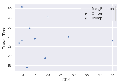
There are a couple things to note from this example:
- By using a pandas dataframe, we can just pass in the column names to define the X and Y variables.
- We can use the same column name approach to alter the marker
style. - Seaborn takes care of picking a marker style and adding a legend.
- This approach supports easily changing the views in order to explore the data.
If we’d like to look at the variation by county population:
sns.scatterplot(x='2016', y='Travel_Time', size='Population', data=df)
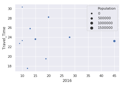
In this case, Seaborn buckets the population into 4 categories and adjusts the size of the circle based on that county’s population. A little later in the article, I will show how to adjust the size of the circles so they are larger.
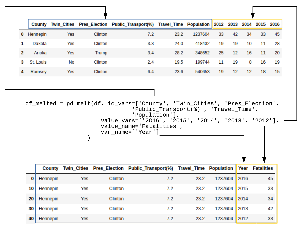
Before we go any further, we need to create a new data frame that contains the data in tidy format. In the original data frame, there is a column for each year that contains the relevant traffic fatality value. Seaborn works much better if the data is structured with the Year and Fatalities in tidy format.
Panda’s handy melt function makes this transformation easy:
df_melted = pd.melt(df, id_vars=['County', 'Twin_Cities', 'Pres_Election',
                                 'Public_Transport(%)', 'Travel_Time', 'Population'],
                    value_vars=['2016', '2015', '2014', '2013', '2012'],
                    value_name='Fatalities',
                    var_name=['Year']
                   )
Here’s what the data looks like for Hennepin County:
| County | Twin_Cities | Pres_Election | Public_Transport(%) | Travel_Time | Population | Year | Fatalities | |
|---|---|---|---|---|---|---|---|---|
| 0 | Hennepin | Yes | Clinton | 7.2 | 23.2 | 1237604 | 2016 | 45 |
| 10 | Hennepin | Yes | Clinton | 7.2 | 23.2 | 1237604 | 2015 | 33 |
| 20 | Hennepin | Yes | Clinton | 7.2 | 23.2 | 1237604 | 2014 | 34 |
| 30 | Hennepin | Yes | Clinton | 7.2 | 23.2 | 1237604 | 2013 | 42 |
| 40 | Hennepin | Yes | Clinton | 7.2 | 23.2 | 1237604 | 2012 | 33 |
If this is a little confusing, here is an illustration of what happened:
Now that we have the data in tidy format, we can see what the trend of fatalities looks
like over time using the new
lineplot()
function:
sns.lineplot(x='Year', y='Fatalities', data=df_melted, hue='Twin_Cities')
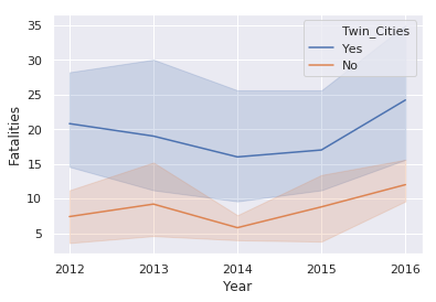
This illustration introduces the
hue
keyword which changes the color
of the line based on the value in the
Twin_Cities
column. This plot also
shows the statistical background inherent in Seaborn plots. The shaded areas
are confidence intervals which basically show the range in which our true value lies.
Due to the small number of samples, this interval is large.
relplot
A
relplot
uses the base
scatterplot
and
lineplot
to
build a
FacetGrid.
The key feature of a FacetGrid is that it supports
creating multiple plots with data varying by rows and columns.
Here’s an example of a scatter plot for the 2016 data:
sns.relplot(x='Fatalities', y='Travel_Time', size='Population', hue='Twin_Cities',
            sizes=(100, 200), data=df_melted.query("Year == '2016'"))
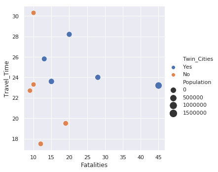
This example is similar to the standard scatter plot but there is the added benefit of
the legend being placed outside the plot which makes it easier to read. Additionally,
I use
sizes=(100,200)
to scale the circles to a larger value which make them
easier to view. Because the data is in tidy format, all years are included. I use
the
df_melted.query("Year == '2016'")
code to filter only on the 2016 data.
The default style for a
relplot()
is a scatter plot. You can use the
kind='line'
to use a line plot instead.
sns.relplot(x='Year', y='Fatalities', data=df_melted,
            kind='line', hue='Twin_Cities', col='Pres_Election')
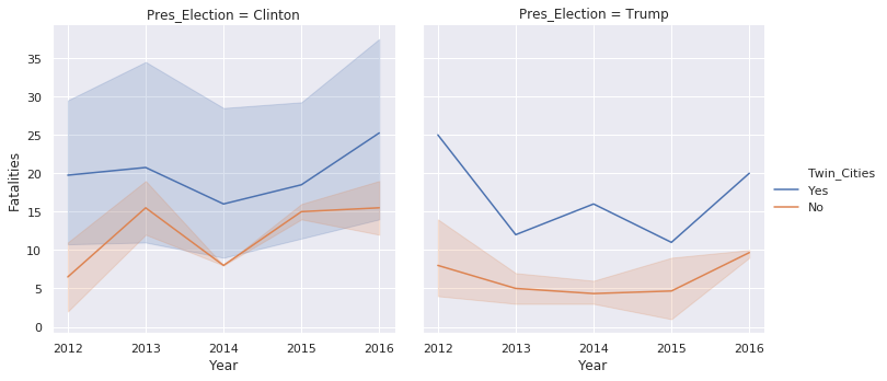
This example also shows how the plots can be divided across columns using the
col
keyword.
The final example shows how to combine rows, columns, and line size:
sns.relplot(x='Year', y='Fatalities', data=df_melted, kind='line', size='Population',
            row='Twin_Cities', col='Pres_Election')
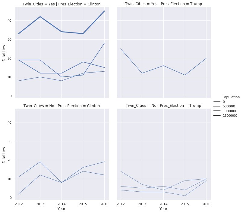
Once you get the data into a pandas data frame in tidy format, then you have many different options for plotting your data. Seaborn makes it very easy to look at relationships in many different ways and determine what makes the most sense for your data.
Name Changes
There are only two hard problems in Computer Science: cache invalidation and naming things. — Phil Karlton
In addition to the new features described above, there are some name changes to
some of the functions. The biggest change is that
factorplot()
is now
called
catplot()
and the default
catplot()
produces a
stripplot()
as the default plot type. The other big change is that the
lvplot()
is renamed to a
boxenplot().
You can read more about this plot type
in the documentation.
Both of these changes might seem minor but names do matter. I think the term “letter-value” plot was not very widely known. Additionally, in python, category plot is a bit more intuitive than the R-terminology based factor plot.
Here’s an example of a default
catplot()
:
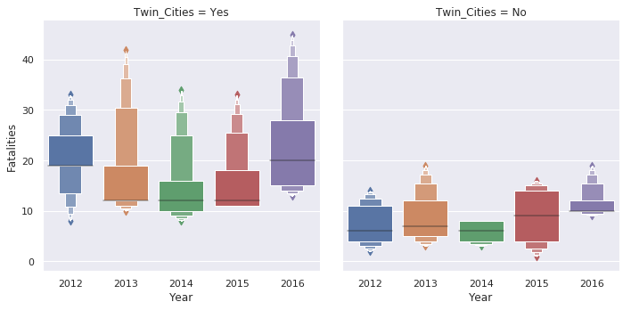
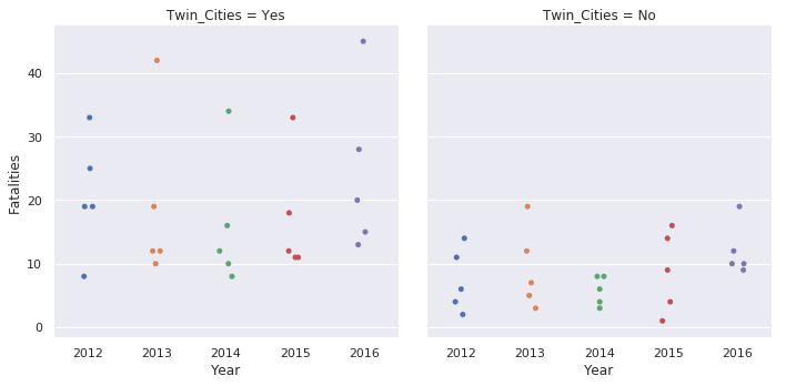
sns.catplot(x='Year', y='Fatalities', data=df_melted, col='Twin_Cities')
Here’s the same plot using the new
boxen
plot:
sns.catplot(x='Year', y='Fatalities', data=df_melted, col='Twin_Cities', kind='boxen')
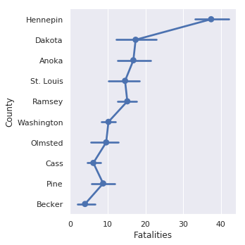
If you would like to replicate the prior default behavior, here’s how to plot
a
pointplot
sns.catplot(x='Fatalities', y='County', data=df_melted, kind='point')
The categorical plots in seaborn are really useful. They tend to be some of my most frequently used plot types and I am always appreciative of how easy it is to quickly develop different visualizations of the data with minor code changes.
Easter Egg
The author has also included a new plot type called a
dogplot()
. I’ll
shamelessly post the output here in order to gain some sweet sweet traffic to the page:
sns.dogplot()

I don’t know this guy but he definitely looks like a Good Boy!
Final Thoughts
There are several additional features and improvements in this latest release of seaborn. I encourage everyone to review the notes here.
Despite all the changes to existing ones and development of new libraries in the python visualization landscape, seaborn continues to be an extremely important tool for creating beautiful statistical visualizations in python. The latest updates only improve the value of an already useful library.
Comments